TheAntiqua

TheAntiqua’s proportions are similar to those of the Thesis family members, but with increased contrast between thick and thin strokes, and wedge-shaped serifs. Its diagonal stress subtly refers to the stroke of the broad-nibbed pen.
For a neutral text face to be used alongside TheSans or TheMix, TheAntiquaB is the obvious choice. This family comes in a generous range of seven weights, from Light to Black. The new OpenType fonts have built-in small caps and several styles of numerals, as well as an extensive set of swash initials and endings.
There are two more distinctly different variaties of TheAntiqua:
TheAntiqua Sun was originally made as a corporate typeface for Sun Microsystems; it has sharper details and a simpler structure than other variants of TheAntiqua and is limited to two weights, Regular and Bold.
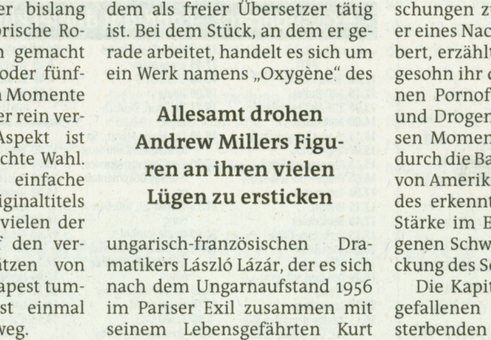
QuaText. A special newstext version of TheAntiqua was developed in close collaboration with the Berlin newspaper Die Tageszeitung (taz). Its sturdy forms were optimized for newspaper stock. This font family is currently being reworked and will be further developed with variable weights that can be adjusted to clients’ specifications.
TheAntiqua in use


