Frequently asked questions
What are the differences between packages?
“C4s” is a package name that we use to distinguish differently configured packages within one font family.
The abbreviation C4s indicates that the fonts have:
- Support for Standard Latin, Central and Eastern European and Latin Extended (C),
- Lining Proportional figures as default (4) and
- Small Caps included as an OpenType feature (s).
General
- Can you tell me more about your package name abbreviations?
Nearly every font family is available in a wide range of differently configured packages. There are packages that support Latin, Greek, Cyrillic and have Lining figures built in as default figure set. Others only support Latin, but come with Hanging figures and additionally built in Small Caps. To distinguish these packages from each other, we use a special scheme for naming our font packages.
Language coverage
A = Standard Latin
B = A + Central/Eastern European
C = B + Latin Extended
D = C + Cyrillic
E = D + Greek
J = A + ArabicDefault Figure Style
1 = Hanging Tabular
2 = Hanging Proportional
3 = Lining Tabular
4 = Lining Proportional
5 = Lower Lining Tabular
6 = Lower Lining ProportionalSmall Caps
s = Small Caps included
c = Small Caps instead of lowercaseOne of our best selling font packages is TheSans C4s. The abbreviation C4s indicates that the fonts have: Support for Standard Latin, Central and Eastern European and Latin Extended (C), Lining Proportional figures as default (4) and Small Caps included as an OpenType feature (s).
If you need further assistance, please send us a short message!
- What are your standard font formats?
Our Desktop fonts are OpenType fonts. Usually “OpenType CFF” fonts, with PostScript outlines, but we’ve also developed some of our fonts with the “OpenType TTF” or TrueType outline format. Those latter fonts contain TrueType Hinting, guaranteeing an ideal screen-reading experience on Microsoft Windows and in its Office applications.
Desktop fonts can’t be used on websites. When you want to use our typefaces on a website, you’ll need webfonts. Our webfonts are OpenType fonts as well, packaged as WOFF2 files.
We also offer variable fonts in TTF and WOFF2 formats.
- How can I order a printed LucasFonts catalog?
As a potential customer you can receive a copy of the lastest LucasFonts typeface catalog free of charge.
Typographic terms
- How can I type combining accents and special characters?
Not all glyphs with accents get a Unicode assigned. Some languages need more characters than what is available in Unicode, or what can be typed from their respective keyboard layouts. Example: in Guaraní there is a G with a tilde accent on top, and in Bulgaria a Cyrillic A with a grave accent above, needed to stress Bulgarian vowels.
In order to use such characters, you have to type the base glyph, followed by a so-called combining accent. The result of these two glyphs acts as one single character, and should not break spelling checkers and search functionality. Sometimes we add such pre-composed glyphs to our fonts, so that they can be inserted from for instance the InDesign Glyphs panel. In other fonts, the accents are positioned with the help of invisible anchors. This can even enable stacking several accents on top of each other.
If you need such combining accents, you must to learn how to type them…
Practical input methods for special characters
- A Guaraní or Bulgarian Windows user can memorize the Unicode for their special accent, like 0303 for combining tilde, and 0300 for combining grave. Type these in MS Word, directly followed by Alt+x. This turns Unicode into glyph, and also works the other way round, very practical. The default font in MS Word, Calibri (designed by us) has plenty combining accents, a good font to test combined glyphs.
- Open the Windows character map application, click Advanced view and search for “combining”. From there you can insert any combining accent (there are many) into any text, regardless of application. Combining accents might not be visible until you type a letter or a space in front of them, so it works best if you first type the base character in the empty box, then double-click one or more combining accents, and copy the combined result.
- On Mac it needs some preparation. System Preferences > Keyboard > [v] Show keyboard and emoji viewers in menu bar must be activated. Then choose Show Emoji and Symbols from the right side of the menu bar. This does not always work. Try again until you see a window. The position, size and visibility of that window is coupled to the application that happens to be active, so it might look confusingly different at times. The window that appears might only show emojis, in which case you need to click on the right top button so you get to see columns, it is named Character Viewer now. Don’t give up. Even though no scaling cursor is shown, this window can be scaled bigger if you grab it accurately by the edges. (Apple UI, grumble) Now type “combining” in the search box. It will find the characters: c o m b i n i n g for you, very smart, but below that, under Unicode Name, it will find endless combining glyphs, even many that have no image. Select the combining accents you need, and in the rightmost column, click on “Add to Favourites”. Now they are easily available, double-click inserts them into text, even when the panel reverts to its smiley-state. (This panel changes with every OS version, and was always troublesome, does it still mess up things when shown on a 2nd screen that gets disconnected?)
- On an iPhone I have no idea how to type combining accents, but if you choose a Bulgarian keyboard and press vowels shortly (not too firmly), then a variant with a grave will show up for some of them. Someone from Bulgaria might need to give Apple a hint about the missing characters – no wait, Apple doesn’t process hints! (nerdy typographic joke).
- You can use third-party software to find and insert combining accents, like PopChar, which already lived on my oldest macs, also available for Windows, or Char Menu Light, from type designer Michel Bujardet, in the App Store.
- Copy and Paste from a correctly built website or other source might also give the desired result.
- What is OpenType?
OpenType fonts are cross-platform compatible, meaning that they work all common operating systems. They support Unicode, and one font file can include over 65,000 glyphs for various languages and writing systems. The OpenType format furthermore supports advanced typographic features, such as small caps, ligatures, various sets of figures/numerals, etc. Those can be accessed in OpenType-savvy applications, like Adobe Creative Cloud. When you use our webfonts, OpenType features can be activated in your site’s CSS.
- What is TrueType?
Technically speaking, the OpenType format is just an extension of what TrueType fonts could already do. Our TrueType-flavored OpenType fonts support Unicode and work on all common operating systems, and they support advanced typographic features.
The difference between our TrueType fonts and other OpenType fonts is that the TrueType fonts have a different outline description, which can contain advanced hinting instructions allowing for more precise adjustment of how letterforms are displayed on computer screens.
- What are OpenType variable fonts?
A variable font is a single OpenType file that can contain several variations of a typeface’s design. For example, all weights and widths from one font family could be stored inside one variable font. The chief benefits of variable fonts are their compact file size, and the ability they offer users to specify coordinates in the design space between the type designer’s predefined variations. The latter benefit gives users significant control over how text appears. Variable fonts may remind some of our older customers of the MultipleMaster and GX technologies pioneered in the 1990s. Currently, web developers have greater control of variable fonts’ features – via CSS – than print designers have within their applications.
- What is style linking?
The different styles (Italic, Bold, Bold Italic) of a style-linked font family can be activated by using the “B” (Bold) and “I” (Italic) buttons in common office and layout applications. Our italic fonts are always style-linked to their roman counterparts. In our Office fonts, the roman, bold, italic and bold italic fonts are all style-linked.
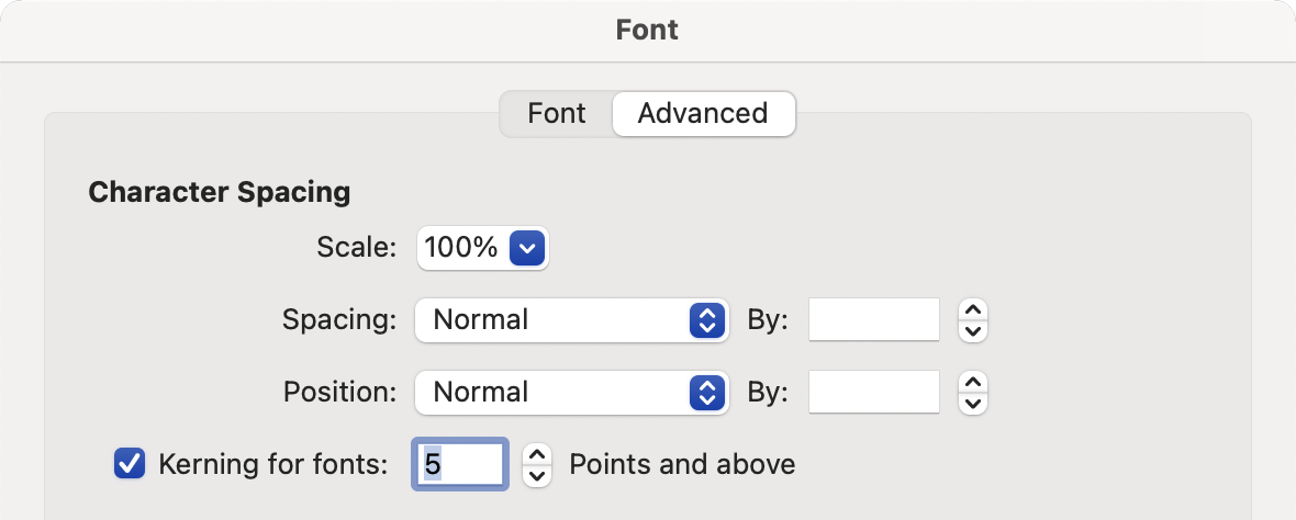
- What is spacing?
Spacing refers to the horizontal positioning of the letters, e.g., the distance between one letter and another.
- What is kerning?
Despite careful spacing some letter combinations have too much space in between. For example the white space between “V” and “O” is much bigger than between “H” and “H”. Therefore, in order to obtain an even text appearance the type designer needs to manually adjust the white space between such critical combinations. This process is called kerning.
- What is hinting?
Hints are special instructions stored inside a font to improve the display of letters on low resolution output devices such as computer screens. While PostScript hinting (in OpenType CFF fonts) produces reasonable results, TrueType hinting enables exact control of how letters are displayed.
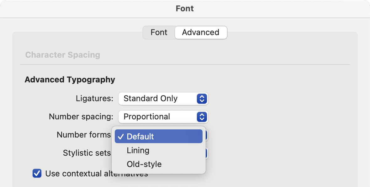
- What are hanging tabular figures?
Our hanging tabular figures are a numeral style you might hear some typographers refer to as “tabular oldstyle figures.” The term “tabular” in the name refers to the fact that, since all the numerals in this style have the same character widths, they can be used to set tables. Or any kind of list where several lines of numerals might be placed on top of one another. The numerals are “hanging” because parts of some of them make use of space between the lowercase ascenders and descenders. For instance, the 6 and 8 have elements that ascend, while the 3, 4, 5, 7, and 9 have descenders. Depending on the typeface, the tops of the 0, 1, and 2 will either be optically at the same level as the lowercase letters’ x‑height, or slightly higher.
- What are hanging proportional figures?
This style is also known as Oldstyle Figures (OSF) or Mediaeval Figures; it is the style most used in traditional text composition. Just like the lowercase alphabet, a hanging figure range has ascending (6 and 8) and descending (3, 4, 5, 7 and 9) glyphs. The heights of 0, 1 and 2 usually correspond to the x‑height of the alphabet. Because of these similarities, oldstyle figures make for a better flow with mixed-case text. They don’t combine well with text set in all-caps.
- What are lining tabular figures?
Since tables require strict vertical organisation in columns – with thousands, hundreds, tens, etc. being clearly differentiable from each other – tabular figures are versions of the numerals that are monospaced. This means that all of them have the same width, from 0 through 9. We often beef up the “1” with a bottom serif, so that its optical width matches that of the others. Our tabular lining figures have the same height as normal capital letters.
- What are lining proportional figures?
In proportional figure sets, each figure has its own typographically adjusted width. Lining figures have the same height as the capitals in the alphabet. They line up perfectly with text set in all-caps. They are very conspicuous when used within a normal body text set in mixed case (lowercase with capital initials), and therefore not ideal for that purpose.
- What are lower lining tabular figures?
These are the figure styles you’ll want when lining figures are preferred over hanging figures, but numerals that are as tall as the normal capital letters seem to stand out too much. Low figures may be a solution. With their reduced height (approximately 97% of the cap height) they blend in with lowercase text better. Lower lining tabular figures also have monospaced spacing for the numerals, meaning that 0 through 9 have the same common width.
- What are lower lining proportional figures?
These are the figure styles you’ll want when lining figures are preferred over hanging figures, but numerals at cap height seem to stand out in your text too much. Low figures may be a better solution! With their reduced height (approximately 97% of the cap height) they blend in with lowercase text better.
- What are small caps?
Small Caps are smaller versions of uppercase letters. They usually seem to have the same heights as the tops of lowercase letters without ascenders (a, c, e, m, m, o etc.). Nevertheless, they are often slightly larger than the lowercase letter height, depending on the needs of the typeface’s design. Small Caps are often used as an element within a greater typographic hierarchy, alongside italic and bold text. Additionally, Small Caps are often used to set the names of authors or other persons within a text, or for the setting of acronyms.
- Can you clear up the confusion around the Dutch IJ?
Unlike old typewriters, Dutch computer keyboards don’t have a key for the Dutch IJ, or de lange ij. We simply type an “i” and a “j”. IJ is not normally treated as a single character – when the font gets a bit of extra spacing (or a text gets tracked out), the ij should also get the same amount of extra space between the “i” and the “j”. It’s only when the amount of letter spacing gets huge that a typographer might choose to keep “I” and “J” closer together.
The characters IJ and ij – added into Unicode as 0132 and 0133 – do not occur in texts. They only have Unicode values to enable backwards compatibility with typewriters and some industrial-period typesetting systems, like those used to produce phone books, etc. In written Dutch, you can stress any vowel by placing an acute over it. If the “ij” is to be stressed, the “i” and the “j” should each get an acute accent. When capitalizing words beginning with ij, write both the I and the J with capital letters: IJsje. If you want to make IJ and ij ligatures, enable them with the dlig feature and don’t assign any Unicode values to those glyphs.
As for readable shapes, a capital U with a hole in the left-hand stem works well. In the lowercase, a u with a (wide) descender and dots centered on the stems works, too. In historic documents, a triangular y with dots was often used (ÿ).
Installation and maintenance
- How do I install fonts in Windows?
Windows has a Fonts folder for users to install their fonts in. For exact details, follow these instructions from the Microsoft website.
- How do I install fonts on a Mac?
Select the fonts you want to install in the Finder. There are several ways to install the fonts:
-
Drag the fonts into Username/Library/Fonts, which makes the fonts available to your account only
-
Drag them into Macintosh HD/Library/Fonts, which makes the fonts available to all accounts
-
Use FontBook or other font management software
Or follow these instructions from Apple’s website.
-
- How can I change figure sets with OpenType?
Customers who use OpenType-savvy applications will be able to find OpenType menus or settings in them. These menus contain a number of options for figures, when you use fonts of ours containing these variations. In those settings or menus, you can switch from the font’s default figure style and width to another available variant. Apps that are not OpenType-savvy will only be able to use the font’s default figure style.
- How I can embed my webfonts?
Our webfonts are licensed for self-hosting. In order to use them, you will first need to copy the files to your web server. Then you can specify them in your site’s CSS. Your syntax should look something like this:
@font-face {
    font-family: 'MyWebFont';
    font-style: normal;
    font-weight: normal;
    src: url('fontname.woff2') format('woff2');
}
Now you can add the embedded font to your CSS styles. Don’t forget to specify fallback fonts for browsers without support for the WOFF format:
body {
  font-family: 'MyWebfont', 'Verdana', sans-serif;
}
Check out our webfonts article for more information about installing multiple fonts so that they link to each other (regular to italic, regular to bold, etc.).
- Troubleshoot font issues in Adobe applications on MacOS X
If your fonts are not behaving as expected in Adobe applications, please follow these instructions from their website.
- How can I use OpenType features?
All of the font versions we now sell are in formats that support OpenType features. In order to use those features, customers need to use software applications that include an interface allowing them to access those. This is particularly easy in applications like Adobe Illustrator or Adobe InDesign, which have OpenType menus that allow you to turn particular features on or off individually.
- How can I use Small Caps in OpenType?
In OpenType-savvy applications, there are typically two commands in the OpenType feature menu that regulate small caps. One will replace all lowercase letters in the selected text with small caps; in InDesign, this option is named “Small Caps”. A second option is to replace all letters – uppercase or lowercase – with small caps. InDesign, for instance, calls this option “All Small Caps”.
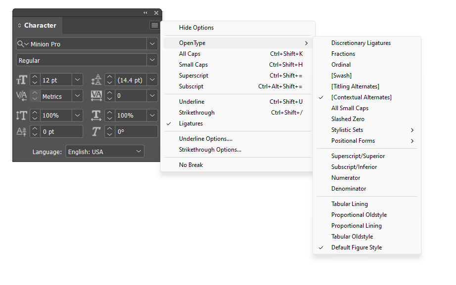
In InDesign, the OpenType menu can be accessed from the Hamburger menu in the Character panel.
- How do I clear font caches?
Sometimes prayer can be the most effective method‽ In all seriousness, clearing font caches can be tricky, especially on MacOS. Sometimes, familiar steps don’t work, and that is very frustrating. We recommed this article on GitHub, which describes how to do this for Mac. One can also do this on Windows, too.
- What’s the difference between Metrics and Optical kerning?
In Adobe’s applications, the default kerning setting in the Character palette is for an option called “Metrics.” These programs allow users to click on that field and make changes. You could enter in new kerning values for a specific letter pair, for instance. But the drop-down menu also includes an option for switching to something called “Optical.”
We put tremendous amounts of time and effort into the spacing and kerning of our fonts. Spacing and kerning are inherent parts of type design. With Adobe’s default Metrics setting, you’ll get the kerning we put into your font. By choosing Optical, you invite Adobe’s programs to re-space your text according to an algorithm it developed in secret. It will wreck the fonts’ spacing and kerning and make your text look worse. We recommend that you never select the Optical kerning option!
- How can I access the Bulgarian Cyrillic in my font?
All LucasFonts supporting Cyrillic include Bulgarian-style letterforms. These are usually alternates within the fonts. To access them, the easiest method is to tell your software that the language you’re writing in is Bulgarian. Then those variants will automatically swap themselves into your text. Microsoft Word – as well as Adobe’s apps and Pages on the Mac – allow you to select a text’s language from a drop-down menu. On the Internet, our webfonts’ Bulgarian alternates appear if your text has the HTML attribute lang="bg-BG" applied to it.
Our Cyrillic fonts also include Bulgarian-style letterforms in a Stylistic Set. The exact number this Stylistic Set has will vary from family to family. Have a look at the Details page for your font package on this website. This is also the only way to get our fonts’ Serbian alternates in apps that support Stylistic Sets.
Office fonts
- What are Office fonts?
Office fonts are font packages that are specifically designed and engineered to work in Microsoft Office software. Office packages come with four font styles: Regular, Italic, Bold and Bold Italic.
They are available for TheSans, TheSerif, TheMix, TheSans Mono, and Corpid in two different font formats: TrueType (.ttf) and OpenType (.otf).
Our TrueType (.ttf) Office fonts:
Our OpenType (.otf) Office fonts:
- How do I access styles and typographic features in Microsoft Office?
Office fonts follow the conventional four-font structure (Regular, Italic, Bold, and Bold Italic), though in Microsoft Office software you will only see the family name in the font menu. The four styles are “linked”, which means they can be accessed using the B (Bold) and I (Italic) buttons in Microsoft Office software.
Multiple languages and scripts (such as Cyrillic and Greek) can be supported simultaneously.
Office fonts come with tabular figures that can either be lining figures, where all figures have the same height as capital letters, or hanging figures (also known as old-style figures), which work very well in running text.

We include extra features in our Office fonts (like lining figures, hanging figures, and stylistic sets), but they do not contain small caps because small caps are not directly supported by Microsoft Office, which does not have full OpenType functionality. More information on figures and small caps below…
- What is the difference between the TrueType (.ttf) and OpenType (.otf) Office fonts?
Both .otf and .ttf font formats can be used cross-platform on macOS, Windows and Linux systems, but there are some software-related differences. If you want to embed fonts in a Microsoft Word document on Windows or save the document as a .pdf file, you will have to use TrueType fonts (.ttf).
To make .pdf files from Microsoft Word with OpenType fonts (.otf) on Windows, you will need additional software like PDF24 or Adobe Acrobat. This is not necessary on macOS. Below is a table comparing the functionality of TrueType (.ttf) and OpenType (.otf) fonts on Windows and macOS.
Applications Windows macOS Microsoft Word TrueType (.ttf) OpenType (.otf) TrueType (.ttf) OpenType (.otf) Read-only font embedding yes no yes no Editable font embedding extra license1 no extra license1 no PDF export with embedded fonts yes extra software2 yes yes PowerPoint Read-only font embedding yes yes yes yes Editable font embedding extra license1 extra license1 extra license1 extra license1 PDF export with embedded fonts yes extra software2 yes yes - ¹
- An extra editable embedding license is required, please contact us.
- ²
- Additional software is required, e.g. PDF24 or Adobe Acrobat. Without it, the text will be converted to bitmap and will not look good.
- Can I use your OpenType (.otf) fonts in Microsoft Office?
Yes you can. You just have to consider a few things:
PDF export
On macOS, you can generate PDFs with embedded OpenType fonts from every application, for example by using the print dialog (Print > PDF > Save as PDF).
Microsoft Office applications on Windows can export PDFs with embedded TrueType fonts (.ttf) using the built-in PDF export. To embed OpenType fonts (.otf) you need additional software, like the free PDF24 or Adobe Acrobat (File > Save as Adobe PDF).
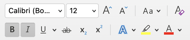
Be careful using Bold
The Regular and Bold styles are not always linked. Use the font menu to find out: if the Bold style does not appear in the font menu, you should select the Regular style and use the Bold shortcut (control/command + B). If the Bold style does appear in the font menu as a separate entry, as might be the case with families that have more weights than just Regular and Bold, you must use the menu to access the proper Bold weight.
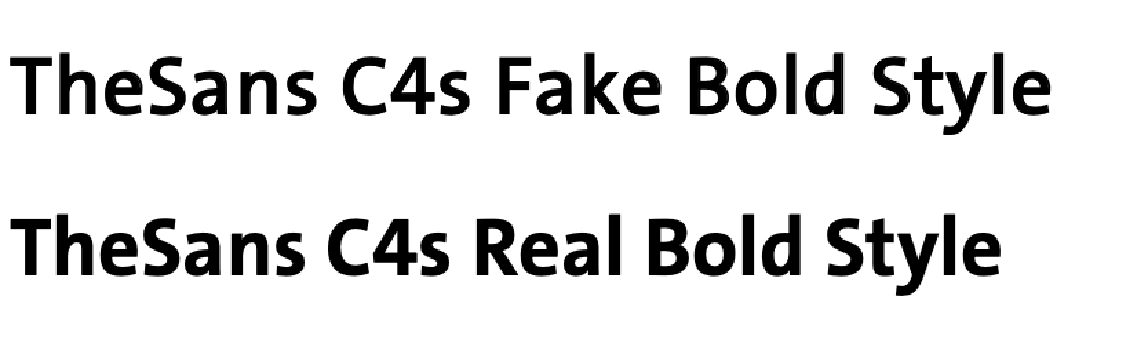
Using the Bold shortcut on a Regular weight without a built-in style link to Bold, or using the shortcut on other weights (for example Light), will always result in a fake “bold” style which is really just the Regular weight with a stroke automatically added around it. Be careful, because the difference can be difficult for untrained eyes to spot, and that fake “bold” is not the beautiful bold font you paid for. It might even print differently from what you see on screen!
Small caps
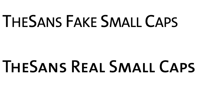
Small caps are smaller versions of capital letters that are designed wider and darker than scaled-down capitals, and are ideal for abbreviations, codes, and subheadings. We have them in many of our fonts. In some Microsoft Office applications there is a button to activate small caps, but they will not be real small caps. The fake “small caps” created by this button will instead be synthetically shrunken capitals that are too thin. We hope Microsoft will enable real small caps in the future.
To use real small caps in Microsoft Word and PowerPoint, you need to install separate fonts that contain small caps instead of lowercase characters. We have a few of those workaround packages ready to go. Just get in touch with us.
Numerals
Our fonts contain several different sets of numerals (also known as “figures”). In Microsoft Word you can use the Number spacing pop-up to choose between Proportional and Tabular figures. In Proportional figures each numerals has its own natural width and in tabular figures all of the numerals have the same width so they align on top of each other in tables. The Number forms pop-up can be used to choose between Lining and Old-style figures. Lining figures all have the same height. Old-style figures have ascenders and descenders. This results in a maximum of four variants for the standard figures.

Superior and inferior figures have their own Unicodes, and can be inserted in the text using the menu: Insert > Symbol > More Symbols… If you know the Unicode of a special character, you can type that Unicode, followed by Alt+X (only in the Windows version of Microsoft Word).
Example: type H2082[Alt-X]O to get H₂O, the chemical formula of water.
Kerning
All our fonts (except the monospaced fonts) contain long lists of kerning pairs. These automatically adjust the spacing between specific letter pairs to get a more even typography. Microsoft Word supports kerning, but you have to switch it on. It is best to switch it on in your document templates, so that all your future documents will have it switched on. But keep in mind that even if you switch it on in your document templates, you’ll have to turn it on manually if you open an old document.
Modern fonts contain complex OpenType kerning, where groups of glyphs are kerned with other groups. PowerPoint on Windows unfortunately only supports the old-fashioned legacy kerning tables in TrueType fonts, which are just a simple and limited list of kerning pairs. We hate PowerPoint for this. As a workaround, our Office fonts contain an additional simplified kerning table just for PowerPoint.
We have compiled this information to the best of our knowledge. If you have questions or additional information please let us know.
Licensing
- What is a single-user license?
A single-user license is our basic license for installing our fonts on your computer. With it, you can install the fonts on up to five computers within one company at one site. Please read our End User License Agreement (EULA) for more information.
- What is a desktop license?
This license allows users to install our fonts on their computers. The font can then be selected in applications’ font menus and used in an unlimited number of works created on the number of computers the font is licensed for. For example, logos or other images made with the fonts in graphics applications may be published as static graphics in any media. You can embed the fonts into a PDF, but only for internal use or for sending your files to a printer, etc. If you need the text of a website, mobile app, or eBook/ePub/etc. – including a commercial PDF – to be set with the font, you’ll need a separate license covering that use.
- What is a multi-user license?
Our license fees depend on the number of computers you want to install the fonts on, as well as on the number of fonts you license and the kinds of media you’ll use the fonts in (e.g., desktop, web, or both). The more fonts you license, the lower the price per font will be. The same is true for the number of users: the more users you license our fonts for, the lower the price per user will become. To view prices for a multi-user license, please add the fonts you’d like into the shopping cart and then insert the number of users they’ll have, as well as their intended media (e.g., desktop, web, or both). The total license fee will be calculated immediately.
- What are company licenses/unlimited-user licenses?
Some customers require a company-wide license, giving them unlimited use of particular fonts. Please contact us for more information.
- What are server licenses?
Our customers request two kinds of server licenses: intranet server licenses and external server licenses. An intranet server license is similar to our Desktop font license, but is issued for a greater number of users, and is usually requested by companies installing the fonts on Intranet servers and allowing them to be accessed by a great number amount of remote users, e.g., for embedding them into documents intended for in-house use. An external server license is a license for customers who offer software as a service online. They have apps running on a server, which customers anywhere can access online. Our fonts can be licensed to run in these scenarios, too. Please contact us for more information.
- What is a web license?
Our web licenses allow customers to embed fonts on websites. The price is based on the number of your website’s monthly page views. Each license covers all the websites stored on one domain, including any subdomains it has. Our web licenses are perpetual. They neither expire after a certain amount of time nor after a particular amount of visitors have come to the site.
- What is an app license?
Our app licenses enable customers to embed fonts into mobile apps. The license covers embedding in a single app title, no matter how many updates or operating system versions the app is developed for. The license fee depends on the number of developers working on the app.
- What is an ePub license?
Our ePub licenses are for customers who want to embed our fonts into ePub files, or in other eBook files with similar formats, including books sold as PDF files. The licenses are for electronic publications where the actual text is displayed using the embedded font.
Our desktop licenses already cover the making of graphics for placement in eBooks, for instance. Those also cover any graphics our customers would want to make for the cover image or title page, etc.
Each ePub license is good for one publication. Our ePub licenses are not priced according to the number of readers a publication has, or by time – only by the number of titles. You can order our ePub licenses for the number of publications they’ll be embedded in. Please contact us for more information.
Pricing and payment
- What is a font family rebate?
Our licensing prices incorporate generous font family rebates: the more fonts from the same family you license, the lower your price per font will be. The same goes for the amount of licensed units: the more units (e.g. computers), the lower the price per unit.
You will receive a font family rebate whenever you license more fonts of the same font (super-)family and license type for your organisation. This rebate will be calculated automatically when you are logged in with your registered e-mail address.
For example, the family rebate for the Thesis family applies to all fonts from TheSans, TheMix and TheSerif.
The mathematical formula to calculate the family rebate may be complicated, but the net effect is that you never pay more for a font package when you license it a few styles at a time than if you had licensed the full number of styles in one order.
- How can I use a discount code?
If you have received a discount code, enter it in your account on the Discounts page. It will then be automatically applied to eligible items that you put in your shopping cart.
- Which payment methods are available?
Credit card: Our website accepts credit card payments directly. Customers who pay via this method are able to download their fonts and invoices immediately after transactions’ completion.
PayPal: Customers may also pay by PayPal. After choosing this option, you’ll be temporarily redirected to the PayPal website. Once you have complete the transaction there, you’ll be able to download the ordered fonts and your invoice from your order history page on our website immediately.
Bank transfer: If you don’t want to pay by credit card or via PayPal, you can choose bank transfer and pay offline. This option sends out a payment request by e-mail. As soon as we register your payment on our bank account, we will make the fonts available for download on your order history page. We’ll inform you of this order status update by e-mail, too. We will include ou bank details are on the invoice we send you; please quote the invoice number as a reference in your bank transfer.
- What currency do you use?
Our prices are in Euro.
You can find out current currency exchange rates at oanda.com. Your bank’s exchange rates may vary.
- What are your bank details?
Account holder LucasFonts GmbH IBAN DE31100700240398565200 Bank Deutsche Bank Privat und Geschäftskunden AG Bank address Kaiser-Wilhelm-Platz 1-2, 10827 Berlin BIC/SWIFT code DEUTDEDBBER Account number 398565200 Branch code 10070024 Please always quote the invoice number as a reference when sending payments by bank transfer.
Account
- How to cancel my account?
Want to have your account with us deleted permanently? Please contact us, and we’ll take the necessary steps.
- Should I register my font purchase?
We have a registration page for customers who have licensed our fonts from a third-party distributor. If you did not purchase a license from us directly, you’ll need to register in order to get support.