Sun

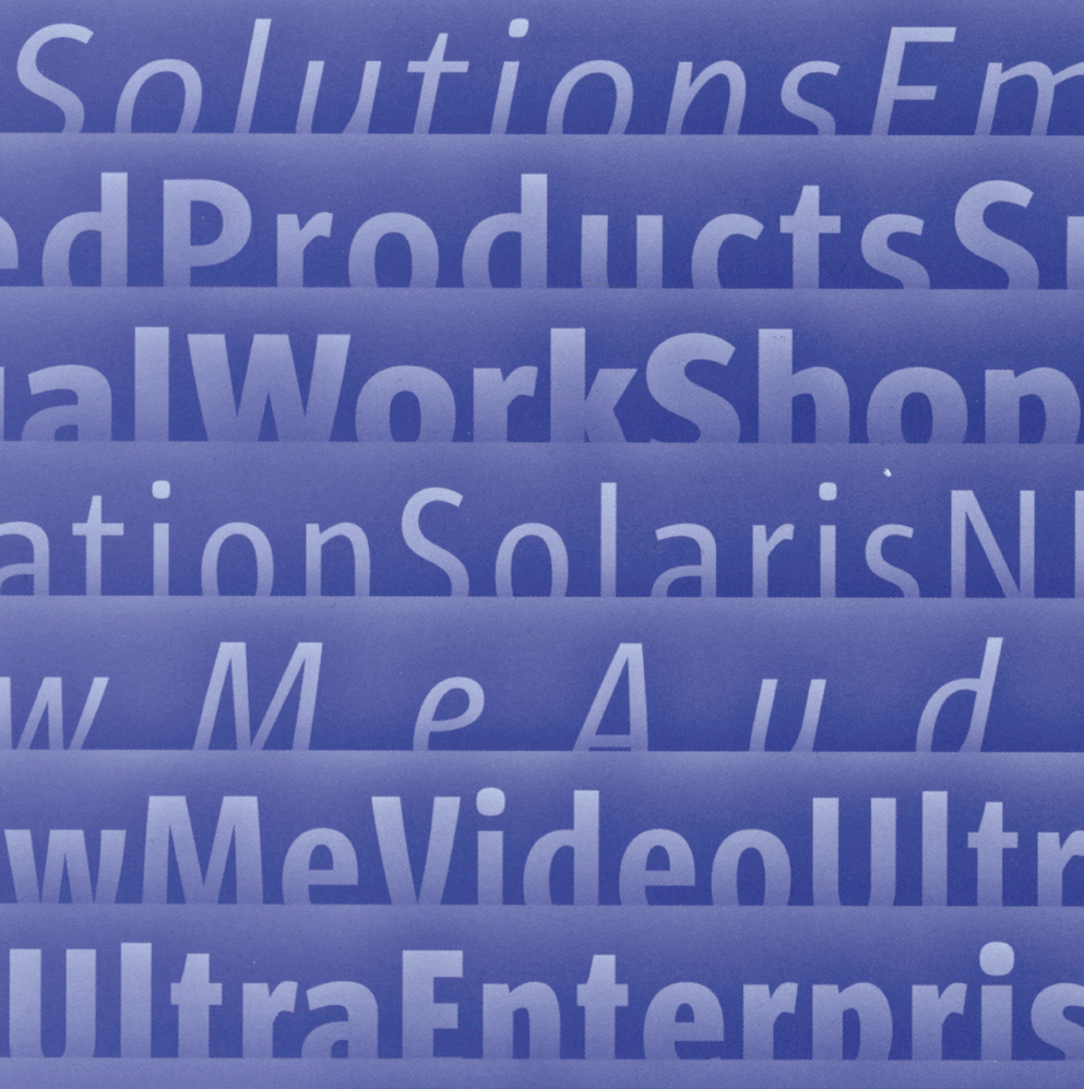
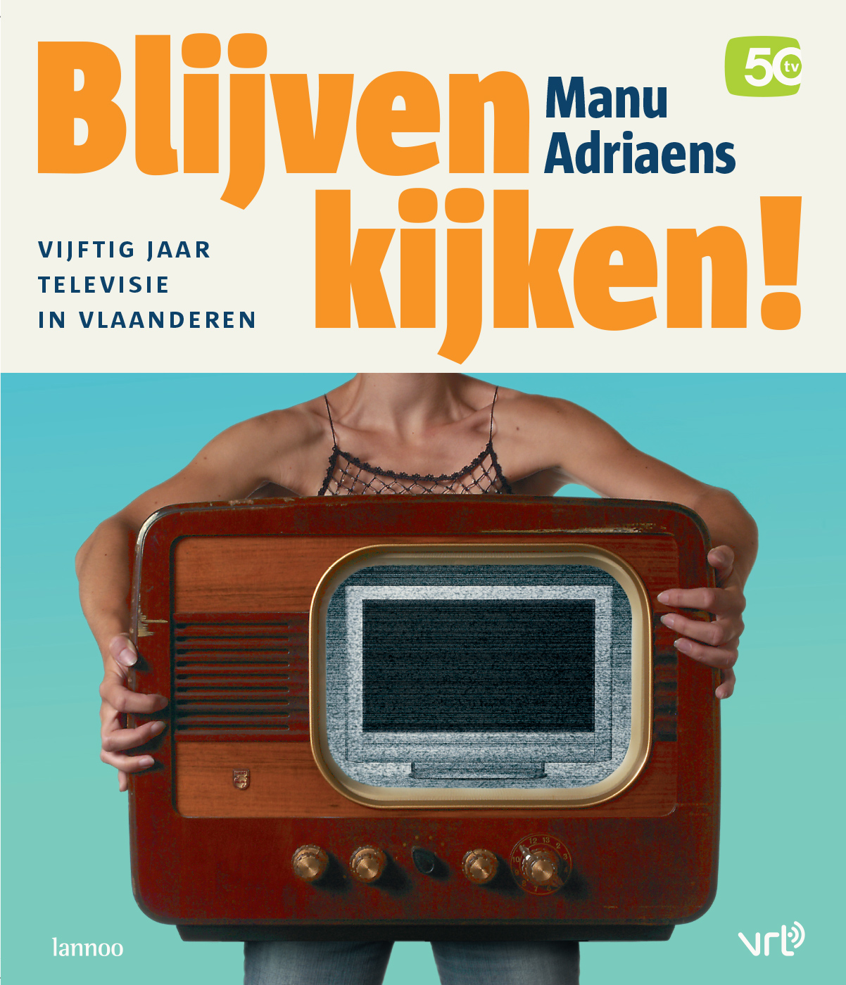
Sun is a headline and text face in two widths, designed for impact and clarity. The typeface was originally developed as part of Sun® Microsystems’s corporate identity, in close collaboration with the company’s Art Director, Chris Haaga. Sun wanted a display face that was similar to sans serif headline faces in US newspapers – i.e., rather condensed and heavy. Luc(as) recalls: “Chris had interestingly bizarre design ideas and the process took a long time. He showed me reference examples of two fonts that I would never have given a second look.”
As the Sun sans serif had to have an American look and feel, Luc(as) decided to refrain from using diagonal stress, the trademark construction principle of his other sans serif faces. Instead, he created subtle weight differences in the character strokes in a time-consuming intuitive trial and error process.
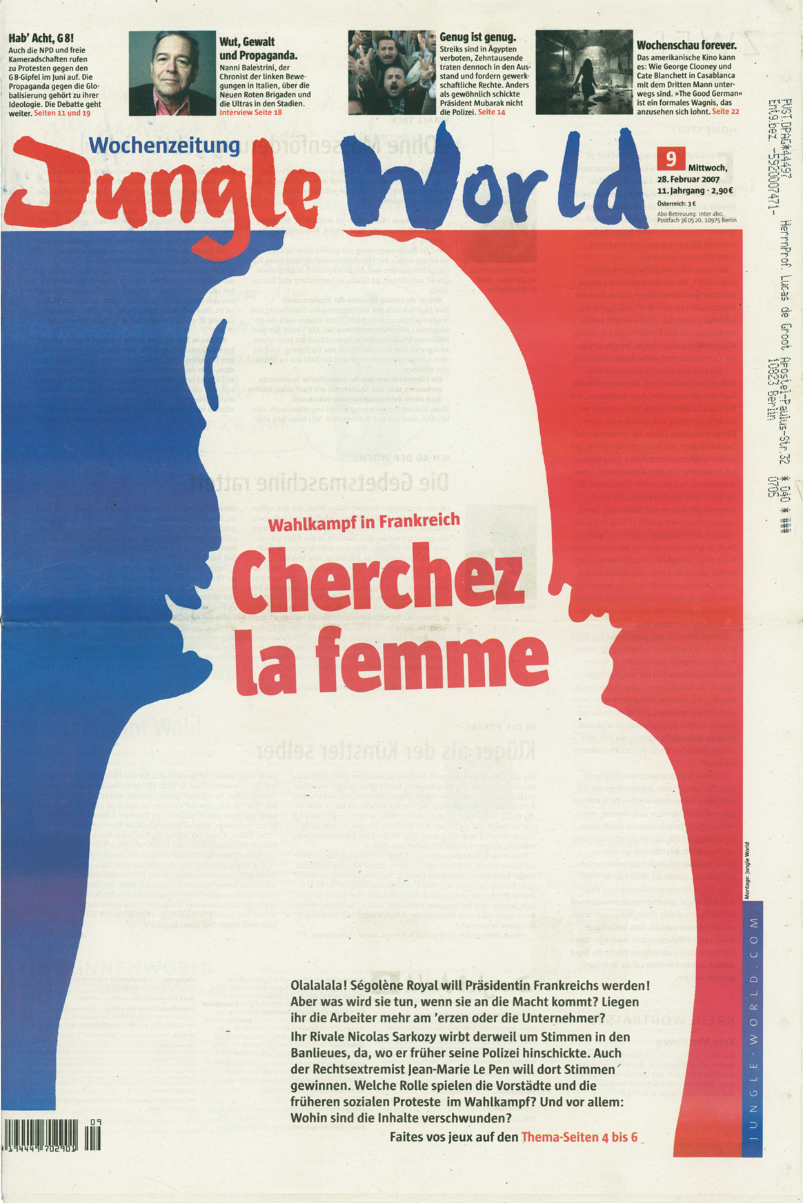
After the exclusivity period expired, the Sun family was expanded, initially for use by the Berlin weekly newspaper Jungle World. For the retail version, which was released in 2000, the family was completed with Italics for the Condensed version; the OpenType version has a Central European character set as well as integrated small caps, extra figure styles and an extensive series of special ligatures.
Sun in use


