Dazwischen
Category: Books + Newspapers
Designer: FH Potsdam
Year: 2016
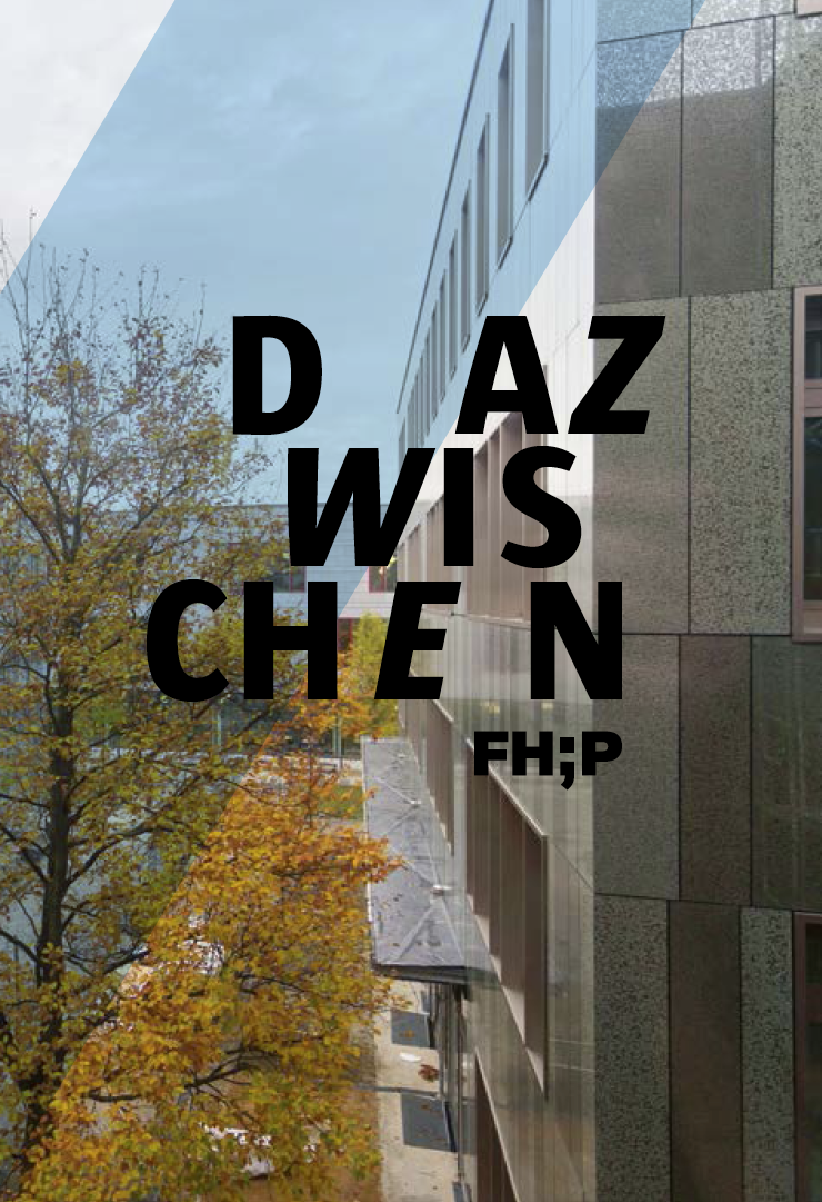
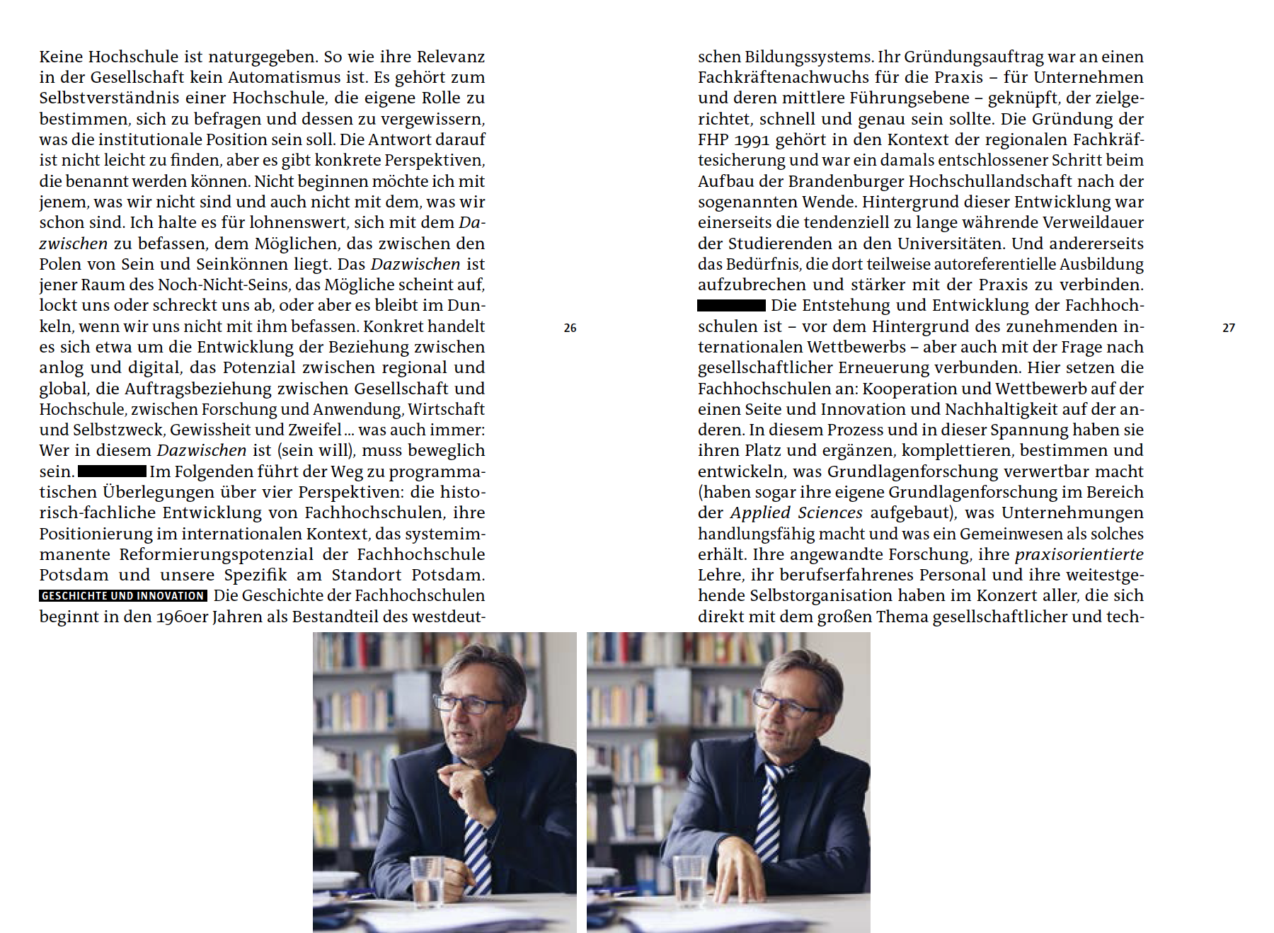
D az wis chen is a 2016 image book published by the University of Applied Sciences Potsdam. The title interprets the German word »Dazwischen«, which means “in-between.” The project was printed to celebrate the university’s 25th anniversary.
The main typeface in the book is a sans serif called Sun, which is also used in the university’s corporate design. The serif typeface that accompanies it is TheAntiqua Sun. Like Sun, TheAntiqua Sun was originally designed by Luc(as) de Groot for Sun Microsystems; it is related to TheAntiqua, which itself is an extension to the Thesis type system (TheSans, TheSerif, TheMix). De Groot is a professor for type design in the university’s design department.