New custom font for Miele
Published Aug 01, 2024. Last updated Aug 07, 2024.

Large companies need fonts that can be used in many areas of the organisation. They must represent the brand identity and function across all touchpoints – from appliance displays to apps, online stores, print, proceedings, and forms or labelling of all kinds. If the client happens to be the premium brand Miele, a minimalist design language with complex font technology requirements is in demand. This is exactly what LucasFonts has developed together with the Miele Design Center over the last couple of years. The result is a sans serif neo-grotesque family optimised for each respective application, which redefines the genre – it bears the name Miele Elements.
Helvetica – too generic?
When Luc(as) de Groot began working with the Miele design team in 2003 to create bitmap fonts and icons for their household appliances, it was not yet clear that he would eventually shape the company’s entire typography in this way. Luc(as) de Groot had already adapted and modernised the company font Helvetica once, because the Miele Design Center was dissatisfied with the way it rendered on the displays of the appliances at the time. Luc(as) quickly improved the existing font for the defined purpose.

Always better - Miele’s motto was also an incentive for Sedat Parta, the designer responsible at the time, not to be satisfied with another small revision, especially as Helvetica was already widely in use and appeared increasingly generic. Sedat Parta: For us as a manufacturer, the brand lacked identity and distinctiveness. Our standards of quality and design didn’t really fit in with Helvetica and the possibilities that a new generation of displays offered us.

For all communication
So the idea was born to develop a custom font for Miele – initially just for use on appliance displays. However, Miele Elements (the working title at the time was Miele Evolution) proved to be a resounding success, as the uniqueness of the typeface and its wide range of applications inspired the in-house designers at an early stage. In the end, management and brand managers decided to use the new typeface for all corporate communications. Since then, the Miele Elements typeface has become one of the cornerstones of the Miele Design System.
The font family now consists of nine weights ranging from Thin to Black, matching original italics, including different figure styles and small caps. The language coverage includes Cyrillic, Greek and extended Latin. There is an Office version of the fonts for use in Office applications, variable fonts for dynamic environments and a Condensed package for special purposes.
Building bridges
Miele’s typography was to be brought up to date both visually and technically, making it ready for the digital future. The Miele Elements font family preserves the visual identity and values of Miele and thus builds a bridge between the Miele values that have been tried and tested for over 125 years, and the requirements of the digital world. This connection creates something very unique and clearly different from what can be seen in the competition.

The aspect of visual identity plays an important role, especially for large companies such as Miele and its brand design. There are also monetary advantages: if a company purchases a custom font, cost-intensive licence models from other font providers and the associated administrative effort can be avoided.
Clearing up inconsistencies
Traditionally, large quality companies such as Miele use neo-grotesque fonts. The new typeface should stay true to the grotesque genre, because high-quality brands need a minimalist design. The more eye-catching the outside, the more short-lived the effect. Coolness doesn’t work that way, says Luc(as) de Groot, who has decades of experience with clients from a large variety of industries.
Good old Helvetica, for example, has many design inconsistencies and outdated details. It is not unusable, but can not be recommended for a company anymore. In connection with the first generations of devices with TFT displays, the opportunity arose to improve many details through the expertise of Luc(as) de Groot.
Improved readability
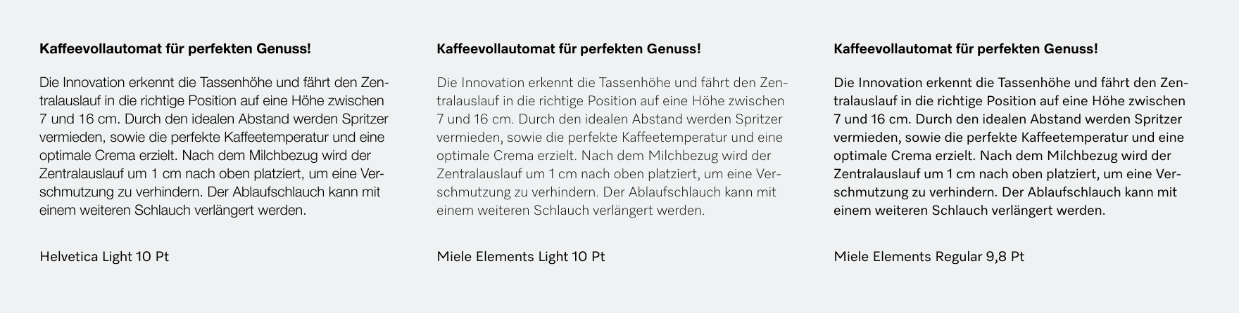
For example, Helvetica sets too narrow, a result of the mass digitisation of fonts more than 40 years ago. Adjustments for different font sizes were rarely made. In the past, the tight-but-not-touching effect was deliberately used in advertising. What was effective and sales-promoting back then usually just looks old-fashioned nowadays. What’s worse, in small text, the tight spacing also compromises readability. So the first step was to create enough space. With Miele Elements, the letters are given generous space to breathe in reading sizes – which results in a balanced overall appearance and reinforces the feeling of timelessness and grandeur. And it significantly improves readability, which is particularly important for users in regard of the maximum font sizes in smaller displays.

The uppercase letters of the predecessor font Helvetica are all roughly the same width. Visually, this creates a certain bulkiness that gives the font a pragmatic, stiff appearance. The Futura capitals, on the other hand, exude grandeur and are based on the classic proportions of Capitalis Monumentalis. However, the widely varying widths of the letters create a sense of unrest in the word image.
Miele Elements combines the best of both worlds: Differentiated proportions with generous spacing. This lends the font a sense of sovereignty and class. Miele Elements also makes use of the possibilities of digital formats: the capital letters, for example, are equipped with an additional kerning table – this is what intelligent fonts look like these days.

Readability per square centimetre
A comparison of the details of grotesque fonts reveals that many of them have unnecessarily complex letter constructions. Miele Elements provides a counterbalance here and simplifies wherever possible for the sake of readability.
One of the golden rules of reading typography is: The eye should glide smoothly across the text without being distracted by unimportant details. It must be possible to grasp the content quickly and effectively.

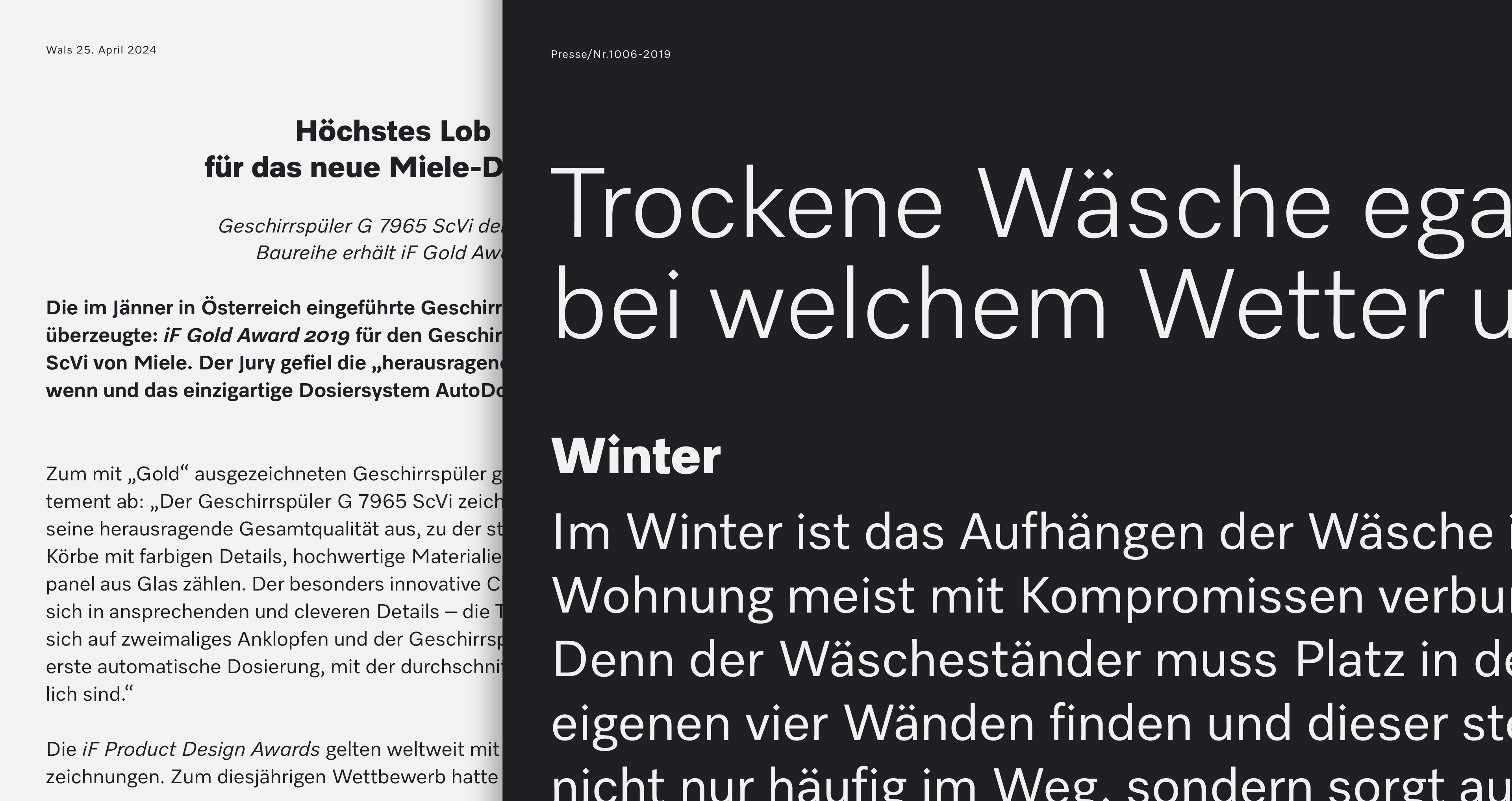
Paying attention to the subtleties of a font can have a huge impact on the big picture – and on readability. Luc(as) de Groot spent many years studying what he calls readability per square centimetre. He determined how different design parameters affect the effective and compact presentation of content in a limited space. Important aspects that play a role in the improved readability of Miele Elements are the introduction of higher ascenders and smaller center heights, which combine to create a more even rhythm overall. An interesting aspect of readability and reading flow: Helvetica Light, which had previously been used in the Miele user manuals, performed particularly poorly in this regard.
Minimal corner rounding
Miele Elements draws part of its formal heritage from the Miele logo. The diamond-shaped i-dot, which has been used here for over 100 years, or the angle of the M and the horizontal letter endings in the word Miele are a nod to the Miele logotype. A good logo never loses its relevance – like good typefaces. Both can be timeless.
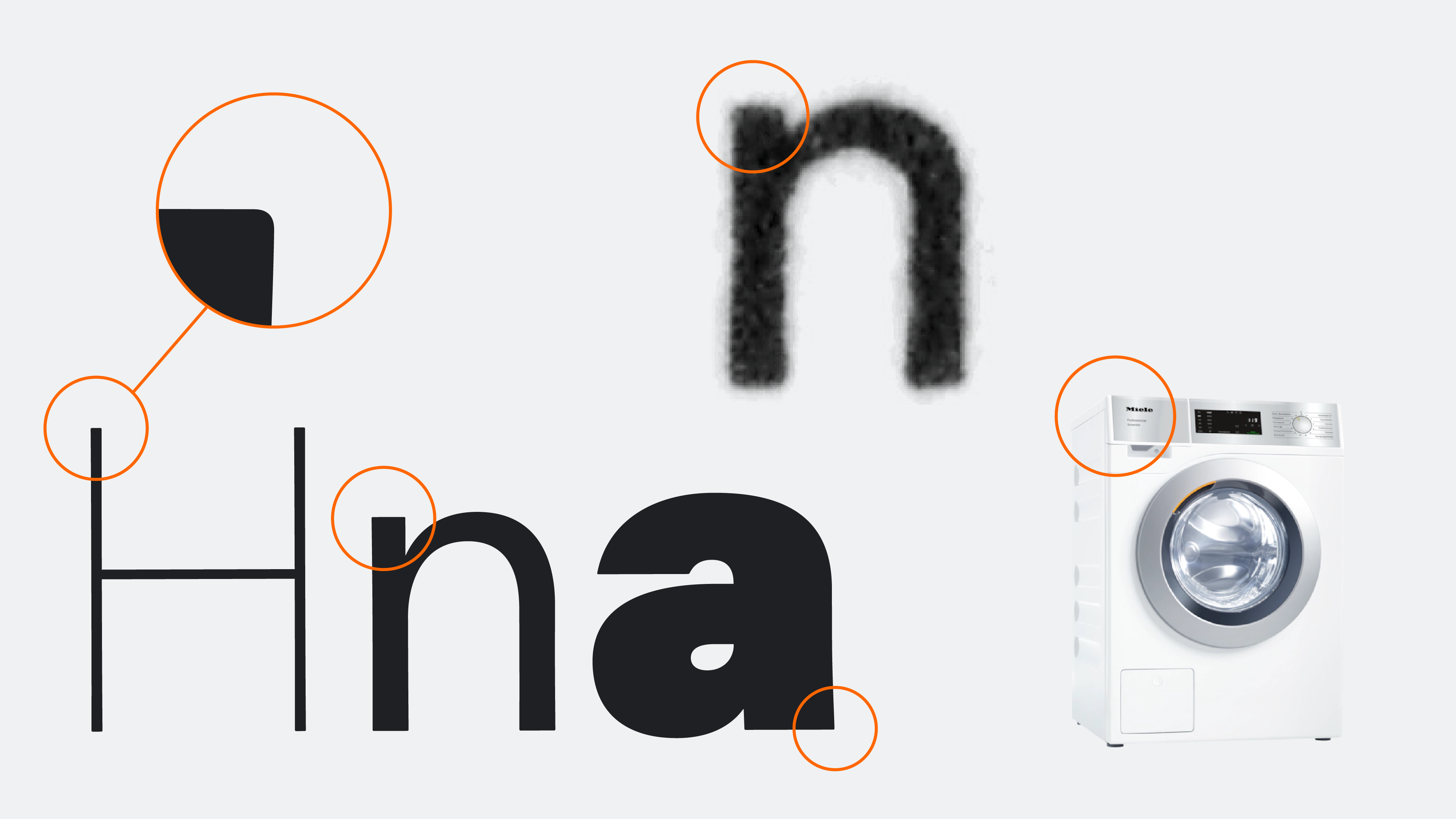
A subtle, barely noticeable but significant feature of the Elements family is the minimal rounding of the corners. These curves have two origins. Firstly, they are influenced by the brand’s timeless product design: Miele appliances look precise and straight-lined from a distance, but if you take a closer look, you will notice that all corners are slightly rounded. The products are always pleasant to handle and therefore easy to use on a daily basis. There are no annoying edges. Miele even goes to the trouble of subjecting the surfaces and edges of its products to a strak process – an important step in product development, especially in automotive and product design.
In the context of design, the strak process refers to the design of surfaces, especially visible surfaces such as car bodies or product surfaces. The aim is to ensure that the design is both aesthetically pleasing and technically feasible.
Modelled on lead type
The new Miele typeface was to be a strictly constructed neo-grotesque that was nevertheless friendly and warm. This is exactly what you find in old prints from lead type. Masterfully cut lead typefaces often looked better than their digital counterparts.
Punch cutters used their craftsmanship to bring form, material and the printed result into harmony. It shows that geometric designs can look pleasant and harmonious. The letter strokes seem to be straight, but in reality they are full of detail and life. This is reflected by the slightly concave stems in Miele Elements.

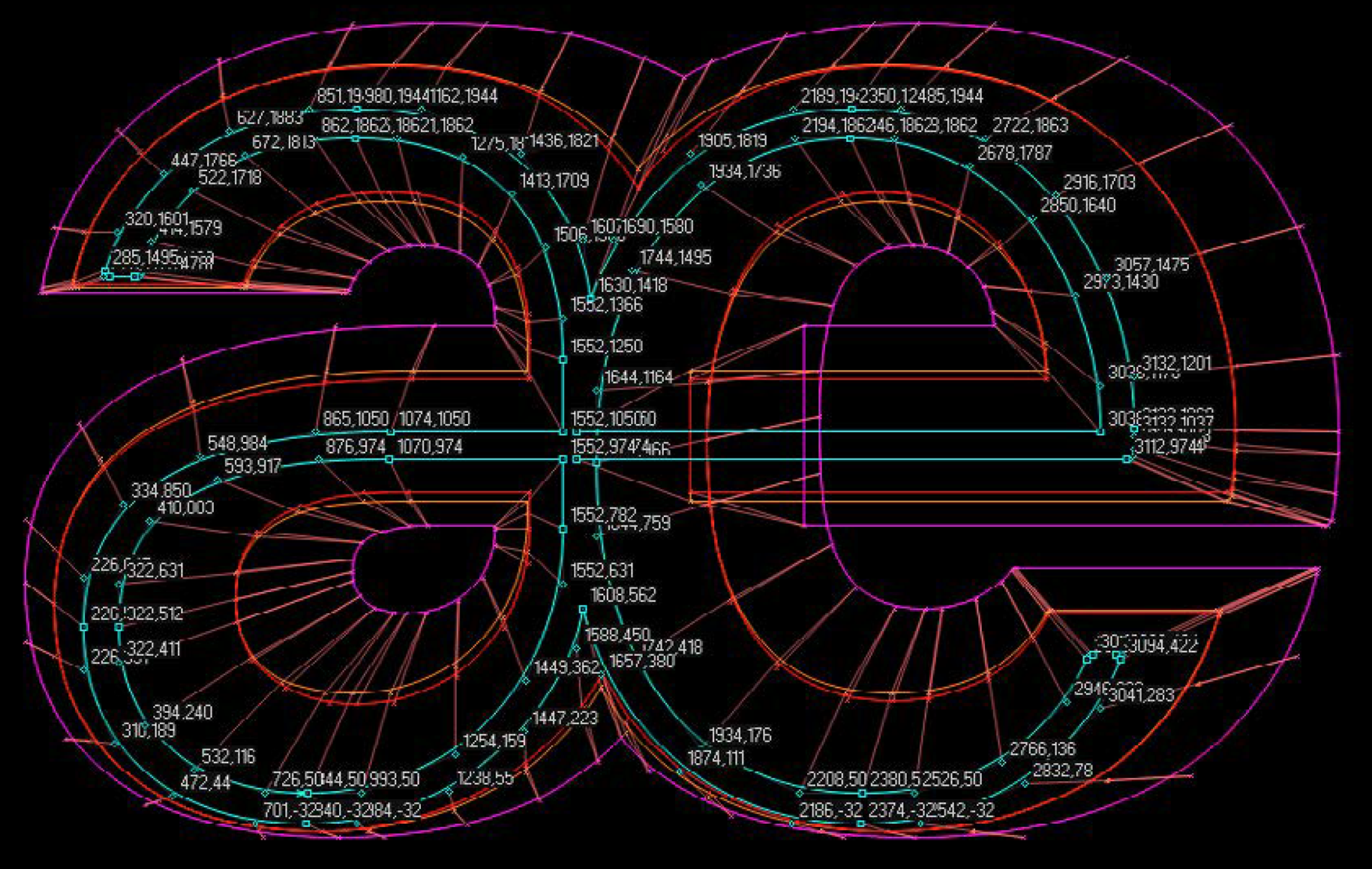
A very fine grid
Typically, fonts are designed on a grid that divides the font size into 1000 units. Miele Elements, however, was drawn on a much finer grid, 4096 units, in order to enable the subtle play with form. The number 4096 is no coincidence: TrueType fonts are scaled and rendered much faster if their basic grid corresponds to a power of two (binary system), for example 512, 1024, 2048, 4096. Thanks to the much higher grid resolution, which is adapted to the digital number space, symbols or other detailed illustrations from the Miele Design System can easily be integrated into the font files.
Many styles and one variable font
LucasFonts wanted to design just one font family for all micro- and macro-typographic purposes. This requires thin and very bold weights: the finer weights for elegant and delicate headline type, the bold weights for robust and loud applications – Miele is equipped for all future design challenges and marketing campaigns.
The middle range of weights, i.e. everything around the Regular, is a perfect fit for long and short copy text.
To ensure data-efficient use on the web, the font family has also been produced as a variable font. A variable font that contains all weights takes up less file size than three individual weights in static fonts. The format therefore inspires interactive and playful applications.


Figures
For differentiated typography, the family is equipped with different figure styles, a must for a modern font. The default are proportional lining figures, which, unlike in other grotesque fonts, are aligning exactly with the capital height. This makes product names look good when capitals are mixed with numbers. However, tabular figures are common in the office environment, and especially apps which need to arrange rows of numbers next to and below each other does not support OpenType features.
There are also oldstyle figures, which are designed as proportional and tabular variants. The latter enable an excellent design of tables, for example to make even extensive data sets easier to read. Superscript, subscript and fractional figures are also a mandatory part of Miele’s digital typecase.

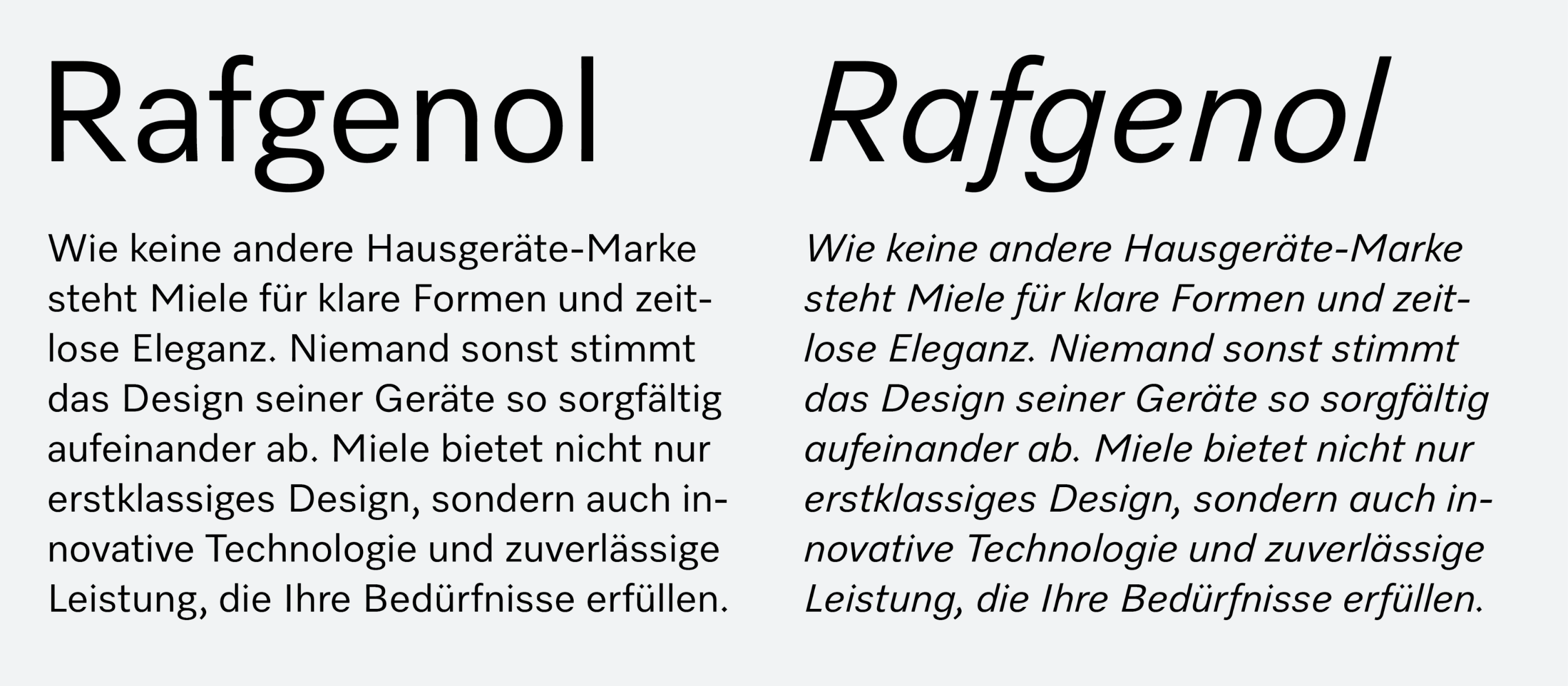
Clearly slanted
Italics are part of the typographic spectrum and must be clearly differentiated from upright fonts. With serif fonts, the difference is achieved by different letter construction, and is usually clearly apparent. Many grotesque fonts are merely slanted – the technical term for this is oblique. If the slant angle is too small, the visual difference to the upright is insufficient.
LucasFonts decided to break with this tradition and chose a generous angle of 14 degrees and some key cursive letterforms to maximise the difference between upright and italic.
If you want to play in the typographic masterclass, you need small caps. They are smaller capitals and visibly taller than the lowercase letters. They can be used as an additional type of emphasis in text, like for product names or abbreviations, and they blend in better with the text than capital letters.
The tops of the small caps are at the same height as the oldstyle figures.

Multilingual
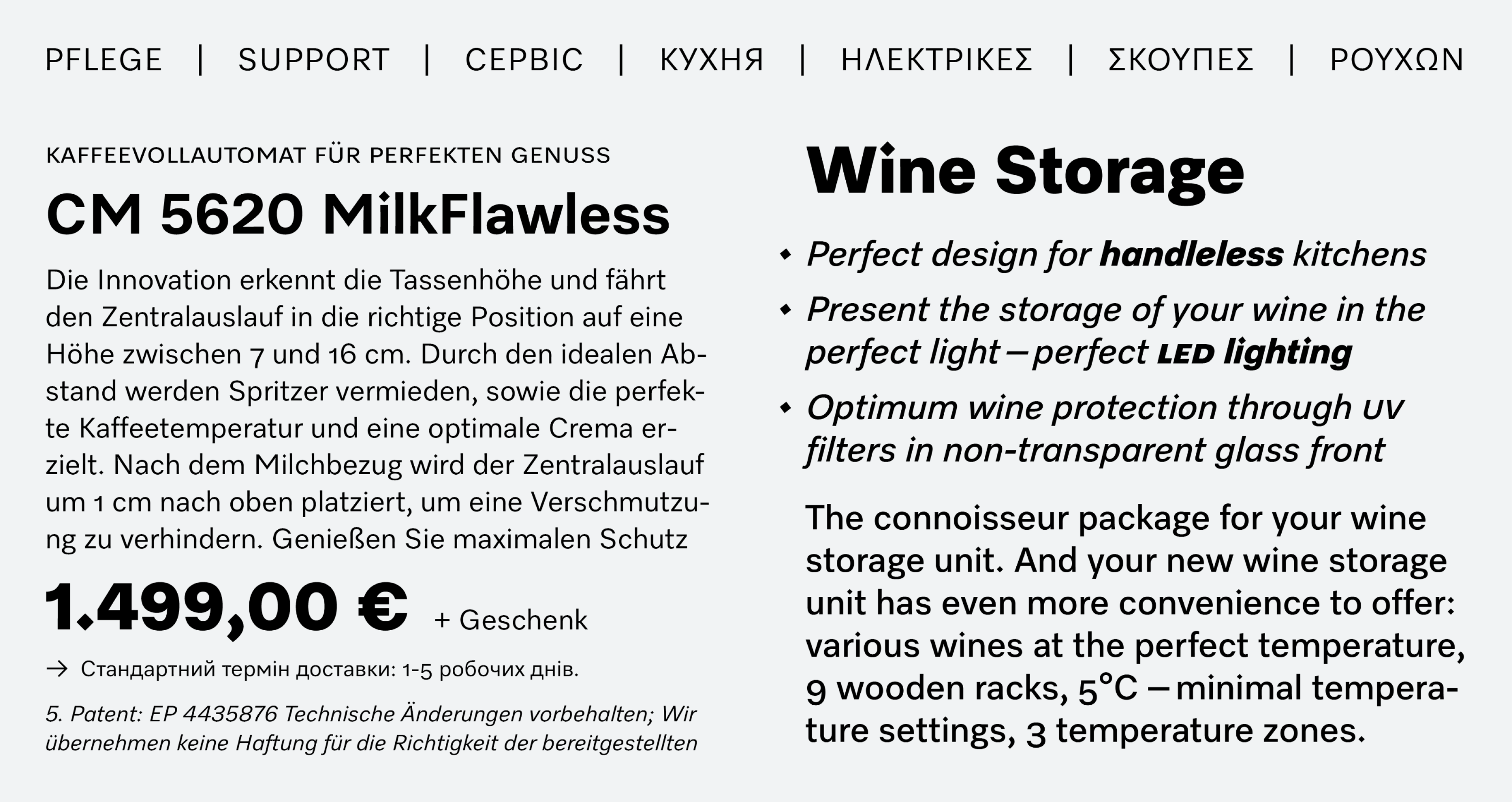
Generous language coverage is essential when you are addressing a global audience like Miele. That’s why Miele Elements supports over 150 languages using the Latin, Cyrillic and Greek writing systems. LucasFonts integrated several language-specific features in the process. The team knows from experience how important it is to respect local typographic preferences. This is part of good manners and ensures that you are perceived as a serious and professional company everywhere. The features include solutions for Dutch, French, Romanian, Bulgarian, Serbian and Macedonian, among others.
LucasFonts has also integrated global fonts into Miele Elements, to provide support for languages such as CJK and Arabic.


Font formats
Miele Elements is used in many different environments. In addition to the interfaces and apps, especially Windows Office environments and browser-based web applications, it was therefore decided to produce the fonts exclusively as TrueType with manual hinting. This was a way to guarantee the best possible screen display, while at the same time reducing the implementation and maintenance overhead by the company’s IT department.
The PostScript-based OpenType fonts commonly used in the design sector would not have been sufficient for this. Their display quality in Windows environments and in the familiar Adobe products does not meet the quality expectations of LucasFonts. With TrueType-based fonts, all details of the display can be controlled by programming in the font itself – provided the appropriate expertise is available – which also represents a considerable gain in convenience during maintenance and use.
In PowerPoint, for example, only TrueType fonts can be embedded and then exported to pdf documents. In addition, neither OpenType features such as different figure sets nor OpenType kerning work here. For this reason, in addition to the large design font package, an additional Office package has been put together consisting of, among other things, tabular default figures and a legacy kerning table which also works in PowerPoint.
More and more icons
The fact that the functions of the appliances themselves are constantly being improved also fits in with Miele’s claim ‘Always better’. The continuous development and updates of networked appliances with new content and functions create a constant need for new icons and explanations. That’s why maintaining, refreshing and expanding the extensive set of icons already available in the Miele Design System is a never-ending task.
These icons can now be found everywhere in the Miele world: on packaging, appliance displays, in the apps, on trade fair booths, in the Miele Experience Centers and online. The characteristic Miele design language is also replicated in the icons. Together with the Miele Elements fonts, they form the visual backbone of the interfaces. Most of the icons are also available in different line widths, are variable, and are often even available as pixel variants in different sizes for the interfaces at Miele via the Design System.
A dedicated icon management tool
The design of new icons and the updating of old ones follows a tried and tested workflow. There are often specific requirements for the various applications – standards and other constraints in the professional or medical sector are particularly important. However, the requirements for icons for domestic appliances often differ significantly from region to region. That’s why LucasFonts updates the fonts for the Miele design team at regular intervals. To prevent surprises during production, this is done according to strict quality assurance processes and specifications.
Each symbol has its own Unicode codepoint from the private use area (known as PUA in technical jargon). LucasFonts developed a custom icon management tool to make it as easy as possible for the design team to manage the icons. The icons, symbols and characters are organised clearly and thematically, can be found quickly by keyword, and copied as Unicode text. The icons can also be exported as SVG files.
Welcome, Miele Elements
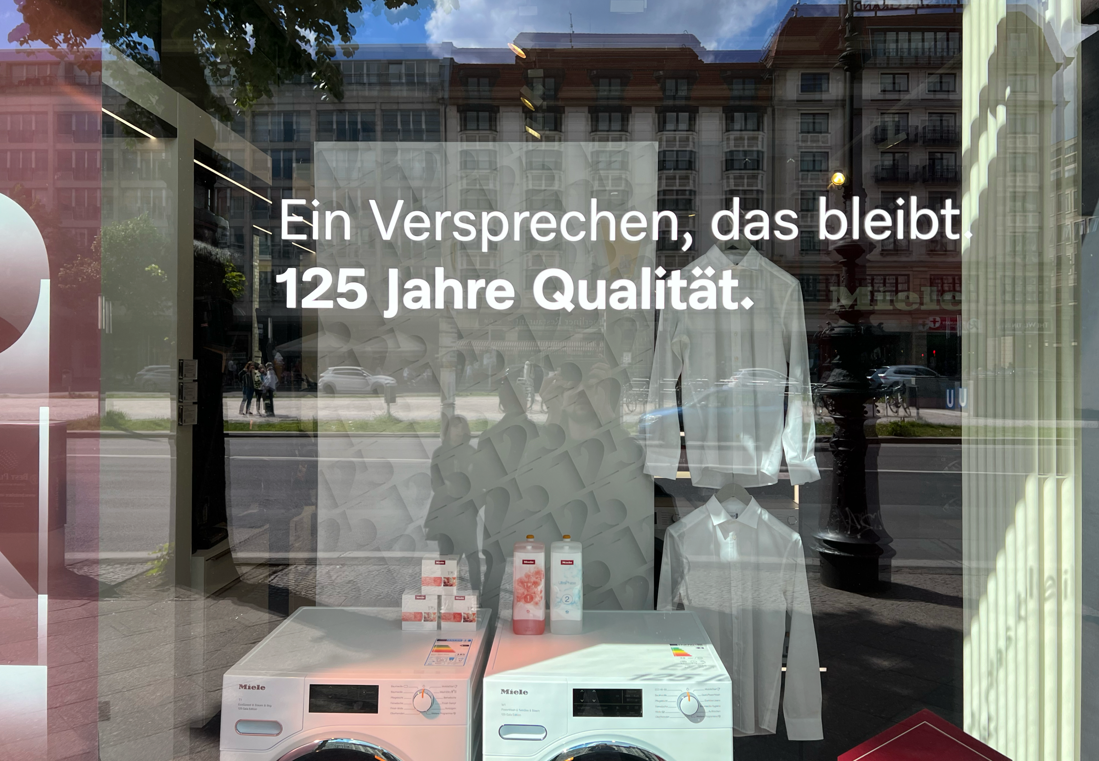
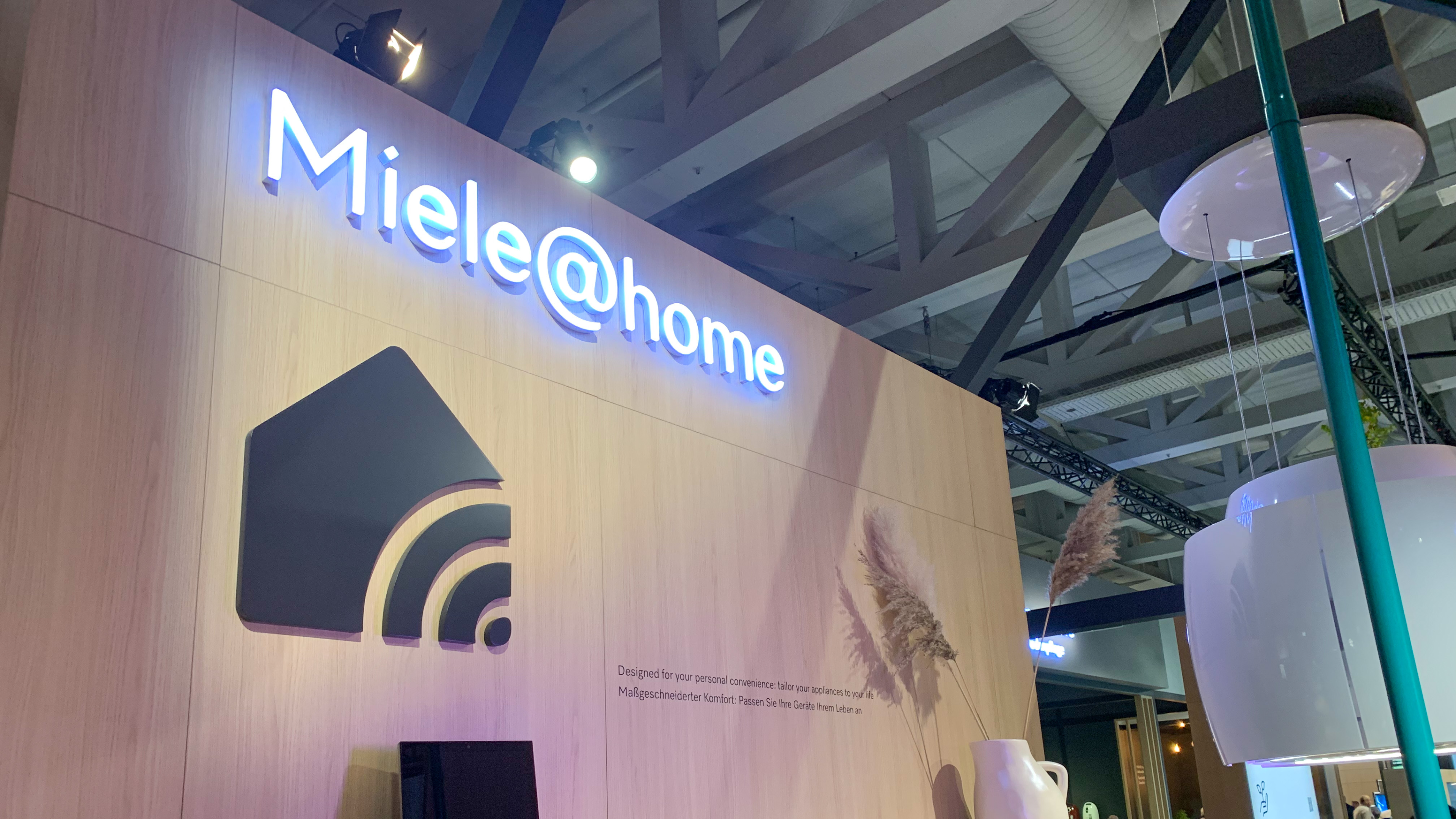
Miele Elements is currently being rolled out throughout the company. You can already see it in use in many parts of the company: in the online presence, in outdoor advertising and, of course, at trade fairs. Its design has already been nominated for competitions and won the Red Dot Award. The font is not only a visual statement and an expression of innovative brand management, but will also be a loyal and identity-forming companion and brand ambassador for decades to come.