LucasFonts newsletter, May 2024
New Spiegel Slab and Spiegel Slab Condensed
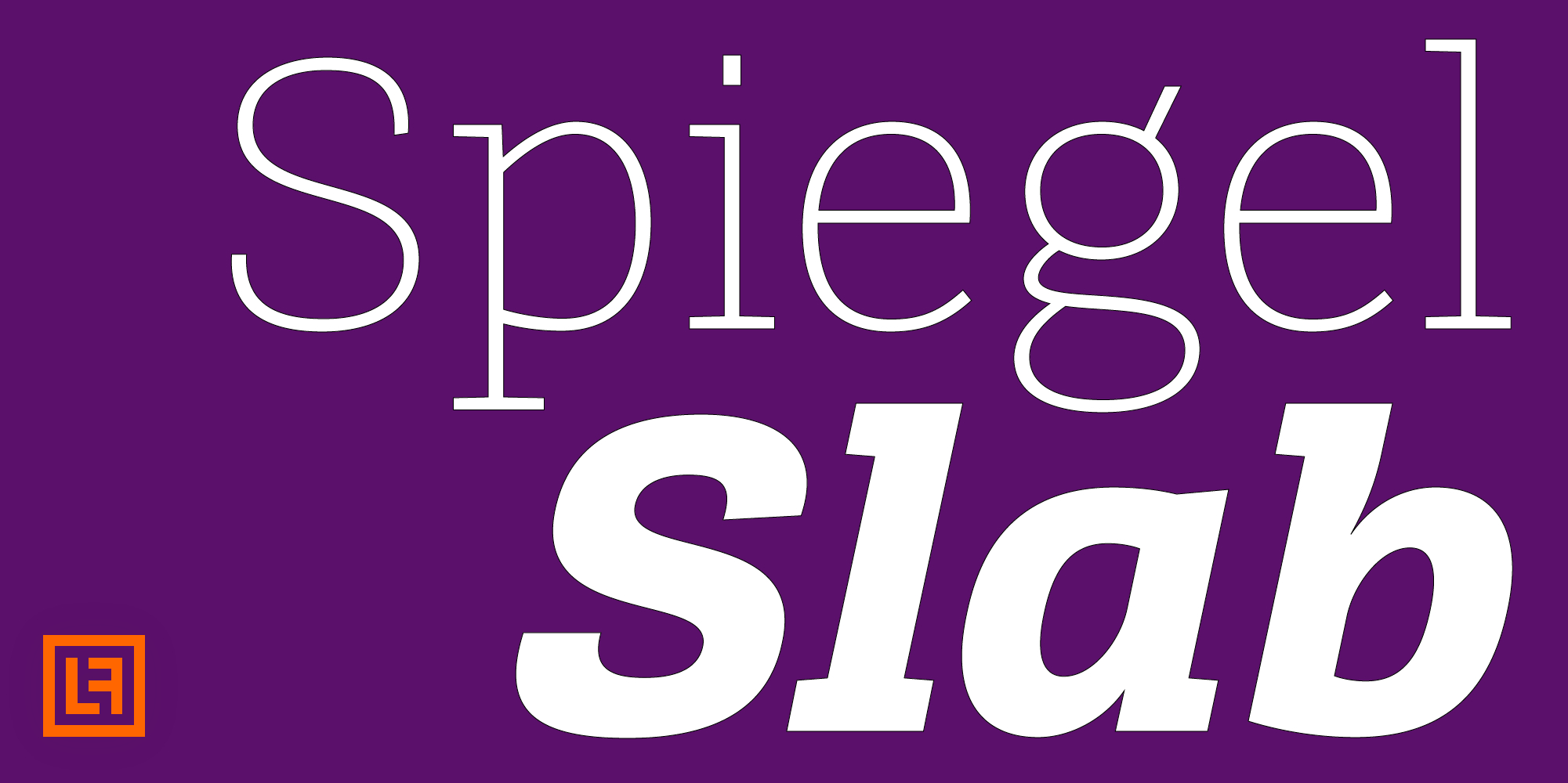
How do you increase visual impact? With a Slab Serif! You should use one!
We can learn a lot from newspapers. They really know how to build visual tension alongside subtle functional typography. They are skilled at organizing masses of text, breaking down complex, busy content into well-structured, eye-pleasing layouts, and making them highly readable. It is a balancing act to tone down parts that are too loud and bring forward blocks that need to be amplified.
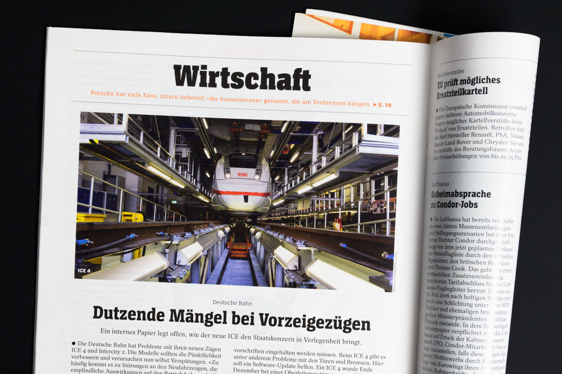
Initially, we designed Spiegel Slab to do just that – amplify the most important parts of the entire page and help with visual orientation. Der Spiegel, a famous German newspaper, came to us with a need for more options to make their typographic language more versatile. What they got from us was a font extension to their already huge typographic system – read more about it here.
Now we are happy to release Spiegel Slab to the world, so you can use it for your own projects! And of course, we recommend using it next to Spiegel Sans.
Spiegel Slab
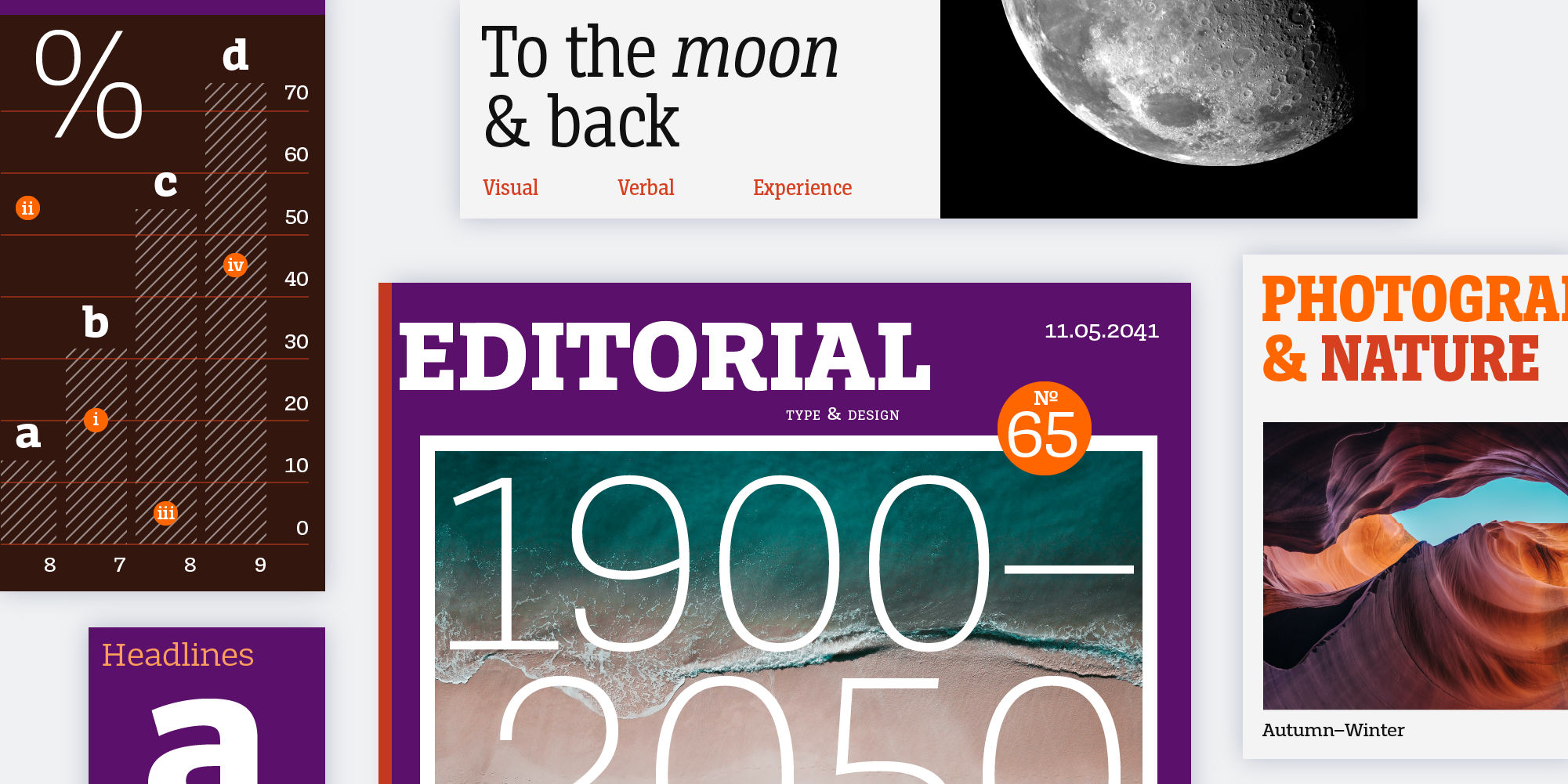
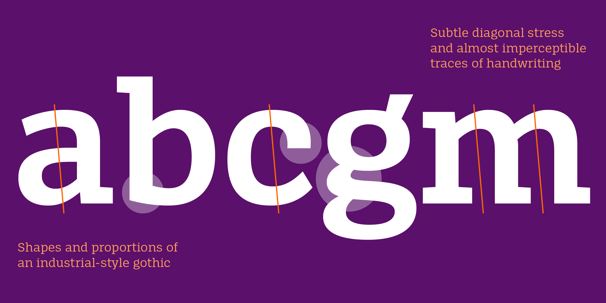
The font family shares the features of Spiegel Sans, including the shapes and proportions of an industrial-style gothic, combined with subtle diagonal stress and almost imperceptible traces of handwriting. Low contrast and robust slab serifs help Spiegel Slab confidently hold its ground on the page for subheads in the lighter weights, as well as being extremely striking in the heavier weights.
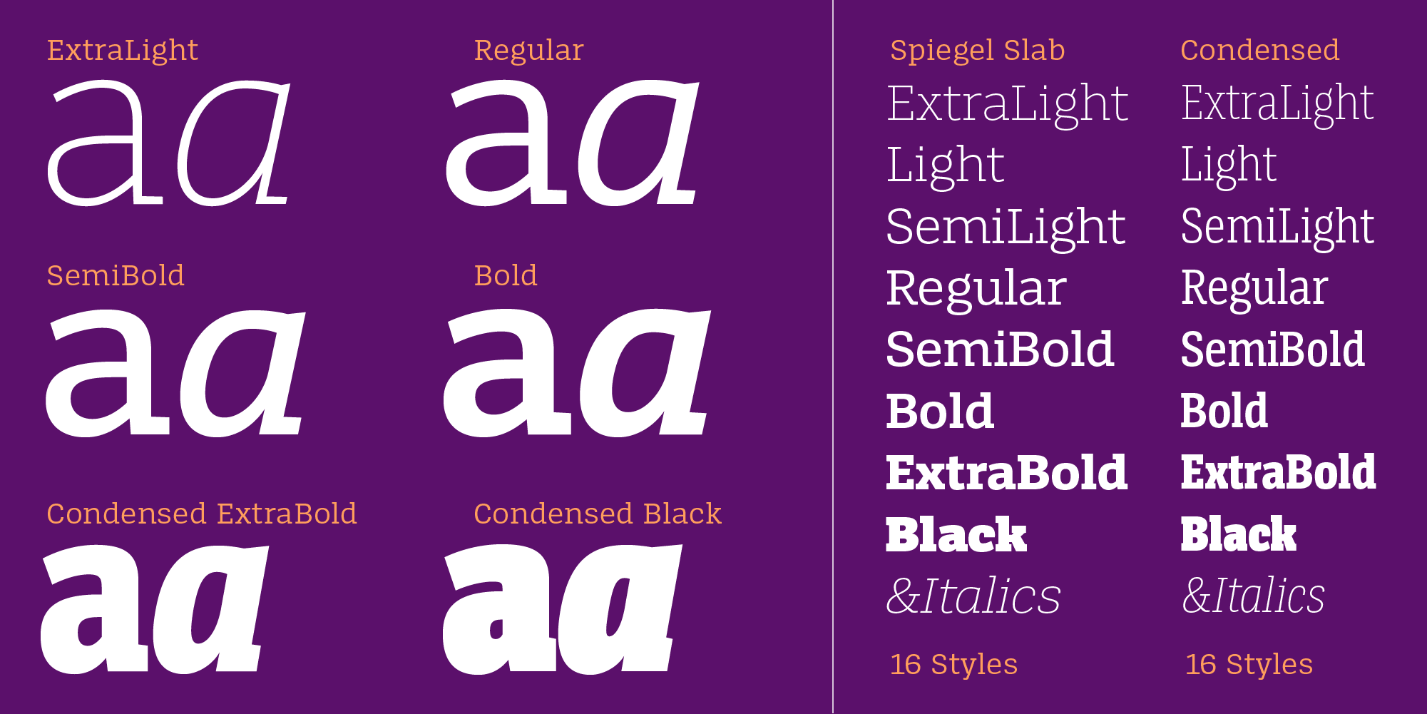
It comes in 32 styles, with 8 weights including italics, normal and condensed widths, and various styles of figures. And of course, as variable fonts. Get it on our website.
Try out first!
In case you missed it, you can try our fonts before you buy. Explore our entire library of fonts and test Spiegel Slab now.
Speaking about Corporate Fonts
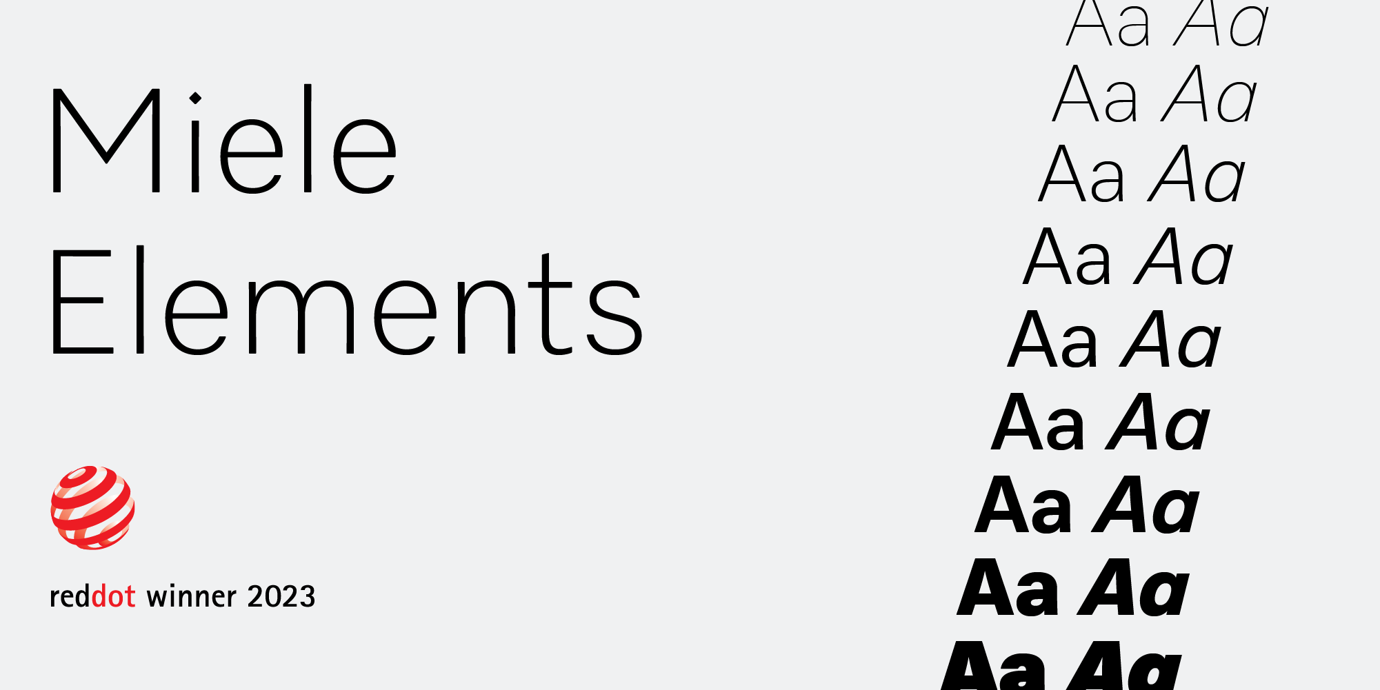
Miele Elements, one of our major custom font projects, was recently released. It has won awards such as the Red Dot Award and underscores the importance of properly crafted custom typefaces for large corporations dealing with complex typographic applications. If you are interested in learning more about the project, stay tuned, we will be publishing an article about it soon!
