LucasFonts newsletter, July 2021
Introducing Tao
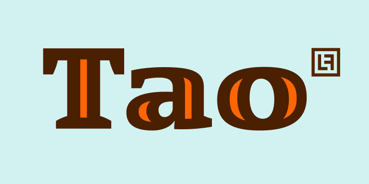
The new Tao font family comes with 7 weights plus italic. When Luc(as) designed some of the so called double-struck capitals for TheAntiqua, he was so pleased with the result that he turned it into a completely new family.
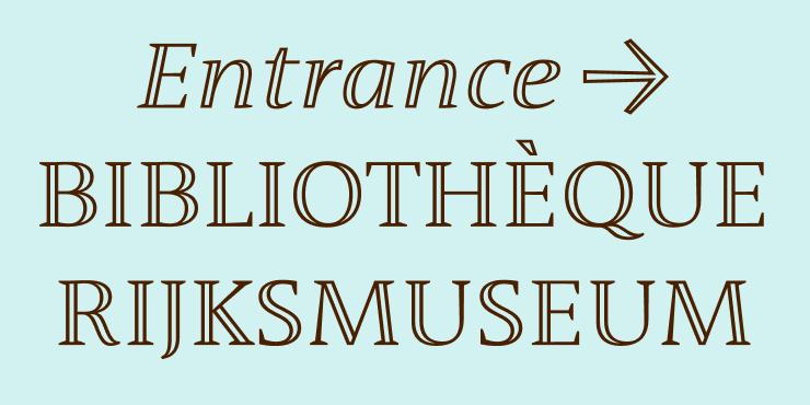
Tao’s thick strokes are built with double lines. The lighter weights look great in elegant signage; imagine wood and metal on serious buildings built for eternity.
The heavier weights become playful and expressive, especially when you load them with color. Just convert them to outlines in your favorite design app and choose your own colors.

Octonions and the monster group
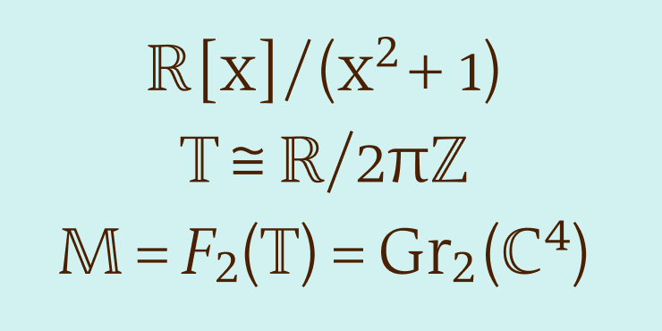
The playful Tao family is bound to woo the hearts of mathematicians. Hardcore math fans can finally use the symbols from their daily work for leisure. This style was originally known as Blackboard Bold – from simulating a bold font with chalk. In the universal character encoding system, Unicode, the style is described as double-struck letters, from using an old-fashioned typewriter to strike the letter twice with a small offset.
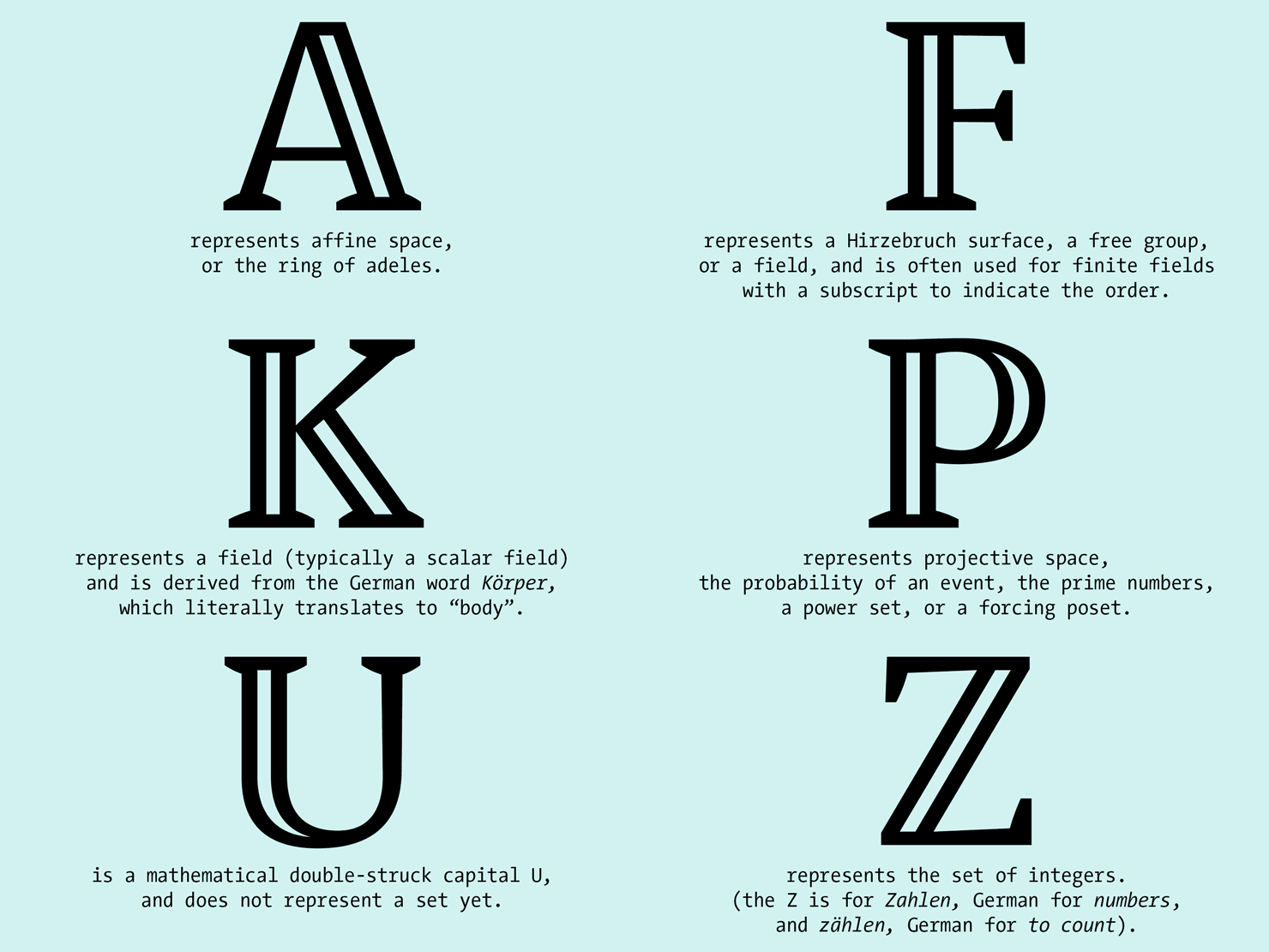
The double-struck mathematical symbols have their own Unicodes and usually denote number sets whose descriptions resemble science fiction titles. For example “A” represents affine space or the ring of adeles, “O” represents the octonions, and “M” sometimes represents the monster group.
Accented letters come in two variations; standard accents are single strokes and when linguistic needs arise you can choose big open accents by activating a stylistic set.
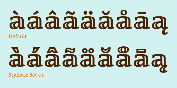
Meet Tao, a luscious serif font that provides playful possibilities. Brought to you by LucasFonts.
Free vintage fonts
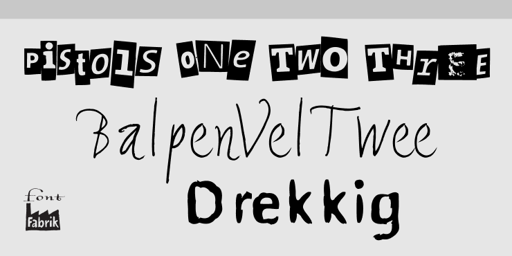
We also added a bunch more free fonts to the FontFabrik® website. Check them out!