Koning Display: technologically-advanced curves
Published Jan 20, 2020. Last updated Jan 27, 2021.
In the last few decades, LucasFonts has developed specialized custom font solutions for all sorts of clients: from newspapers and television stations to pushing the boundaries for electronic companies and several automobile manufacturers; from transparent PNG fonts to variable fonts, for which we built tools first. We gained a lot of knowledge working on those projects, and we have funnelled that technical know-how into our library’s newest typeface: Koning Display.
We are grateful that our efforts have been recognized with numerous awards: TDC Certificate of Typographic Excellence and Award of Excellence from Communication Arts both in 2018, and Gold from German Design Awards in 2020.

We released Koning Display in November 2019. Named after the Dutch word for “king,” the design was an in-house side project we revisited over and over again for about a decade-and-a-half. Time and many revisions allow typefaces to ripen. We even invented new constructions to fine-tune contrast in interpolated weights.
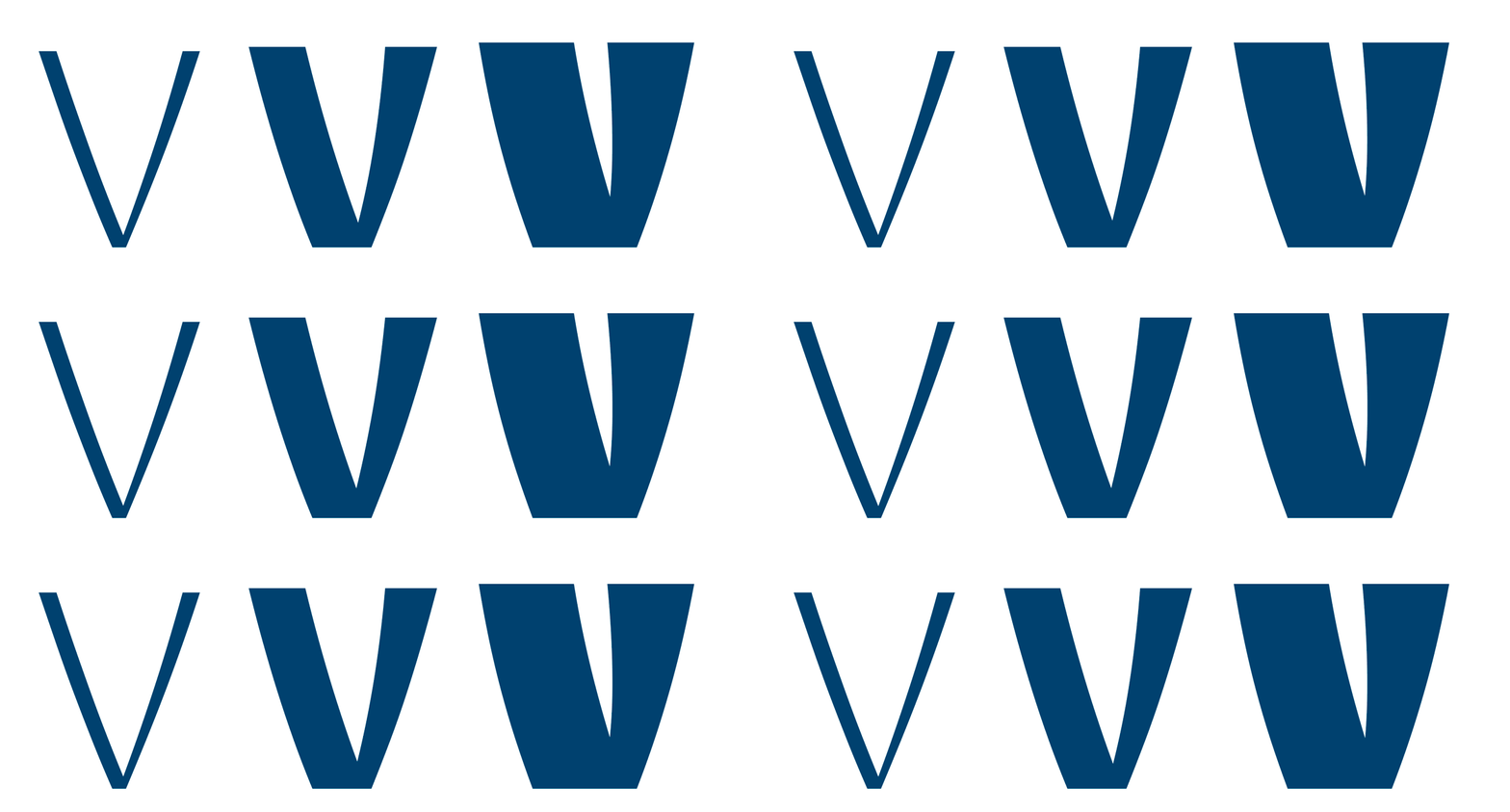
The look of a Koning
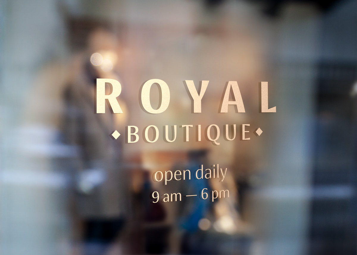
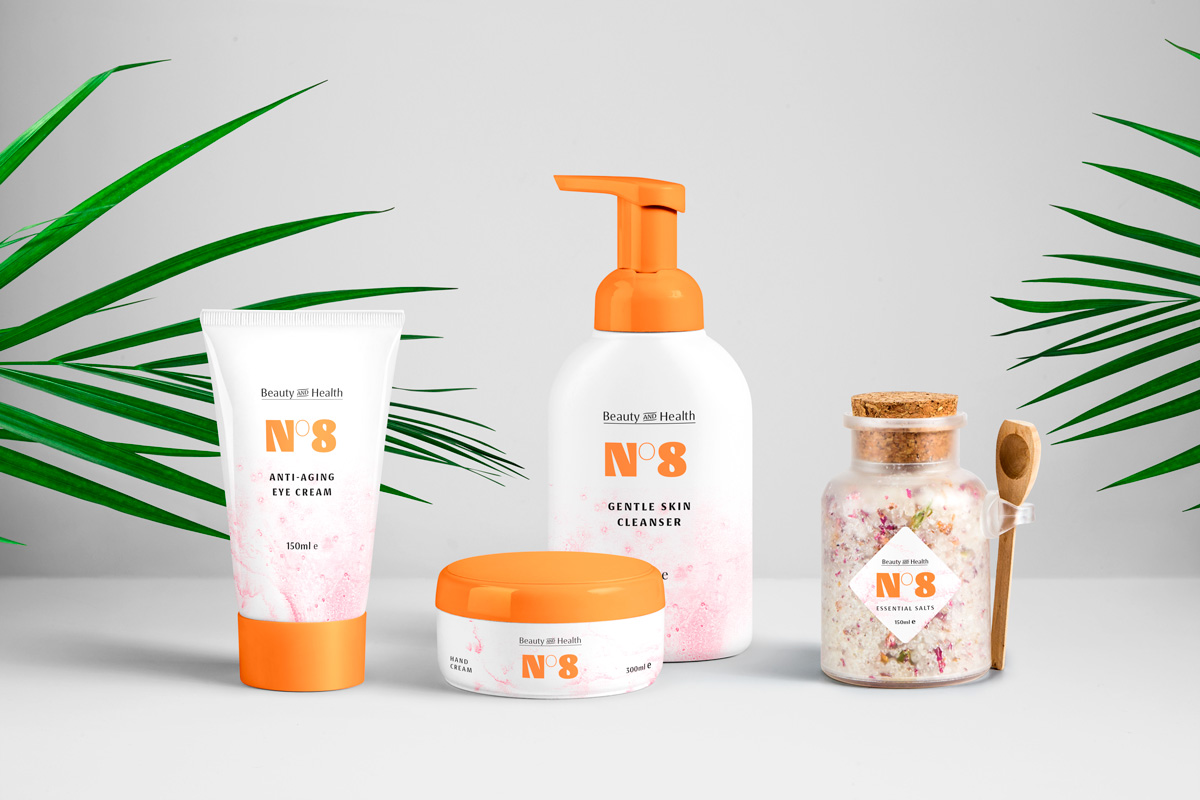
Luc(as) wants to make graphic designers’ jobs easier, but his fonts are not all drawn with a specific area of use in mind. That is everyday work anyway: custom-type clients come to him because they need something specific; Luc(as) is the best font developer who can deliver that for them. This is important because Koning is not specifically intended to be a typeface for editorial design work, for instance, like Floris and Spiegel Sans are. It was not developed for branding on the cosmetics market, either – even though we think it could tackle that kind of application well. Type designers sometimes tell graphic designers what a typeface is for, but Koning is not like that. We are eager for our customers to tell us themselves.
In Koning Display’s Black weight, the counters inside of letters are small. This helps in the overall spacing of the typeface because it allows the font’s default spacing to be compact. Since Koning Display is a display design – the intended size range is right there in the name – the emphasis when spacing and kerning its letterforms was on achieving equal distances between shapes. For a text font, the focus would be more on the rhythm of white spaces inside and between the letters, and all punctuation is to be spaced with more air. In a display font, everything is more compact; differences in distances between punctuation and letter shapes become very obvious and need pair-specific adjustments. Therefore, Koning Display has quite a few kerning pairs. Special techniques were used to keep the size of the kerning data small, to facilitate a smooth webfont experience.
The distinctive swelling of thin stems might seem like a purely decorative decision, but it is actually a means of color control, it fills up spaces inside letters, making the overall texture of a text more even. The regular weights of Koning Display work astonishingly well in small sizes when tracking is applied to add some spacing. The smaller the size, the more tracking is needed.
Spacing and OpenType features
It is not just glyph pairs that have been kerned in Koning Display! Some rare language situations require that glyph triplets get extra treatment. Narrow glyphs, kerned on both sides might provoke the neighbors crashing into each other. Two examples: the strong kerning between the apostrophe and the A is reduced when these follow an L; the kerning between a period and an ordinal is reduced when they are preceded by the numeral 7.

Language solutions
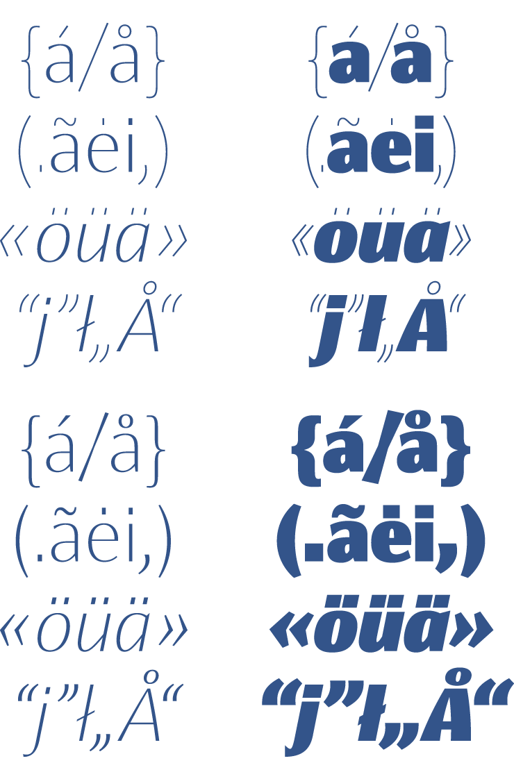
In general, the various international ways of using quotes in text needs special attention. Periods and commas follow the rhythmic spacing of characters, but things like : ; ! ? « » read better when they have some extra space between the letters. So we built that in, as always the French take this so far that they type full spaces in around such glyphs – which, even for French typographic standards, is too much. So, full spaces between double chevrons and words are reduced to a narrow space in French text. The same is true for the : ; ! and ? characters. For Moldavian and Romanian, the cedilla-shaped diacritic is replaced by a form that looks like a comma. In Dutch, a j with an acute appears after the i with an acute.

Koning Display’s fonts include 31 different OpenType features, including ligatures, stylistic sets, and case-sensitive alternates. Visit the Koning Display family’s package details page for a complete list of OpenType features, including before and after samples.
OpenType features
Some of the fonts’ OpenType alternates are typographic options that will be familiar to users of well-made fonts. Aside from the ability to toggle between single-story and double-story letterforms, users can substitute proportionally spaced old-style figures in for the fonts’ default lining figures. Other OpenType features offer much more striking changes to the fonts’ appearance.

Similar forms from the past
Koning is not based on any specific historical models, but some of its characters are still reminiscent of earlier works from the history of lettering and typography. For instance, many of Koning’s strokes are wedge-shaped in a way that is similar to styles practiced by sculptors in Renaissance Florence. Florentine inscriptions have inspired many typeface designers: Hermann Zapf made sketches his Optima typeface on a 1950 visit to the church of Santa Croce in that city. And in the 1990s, Paul Shaw and Garrett Boge made a trio of typefaces that were more literally based on Florentine works (these were Beata, Donatello, and Ghiberti).

The most “Florentine” letters in Koning are the A, E, F, G, K, L, N, Q, T, and Z. These shapes have a long typographic history; the first typographic interpretation of Florentine inscriptions dates back to the 1890s when the American Type Founders Company in the United States introduced their Florentine types. As you can see above, these also featured some letters with asymmetrical counters, although their contours were straighter than Koning’s, which are curved.

Koning is less extravagant than typefaces in the direct Florentine tradition and more lively than mid-20th-century contrasted sans serifs like Optima. Nevertheless, conjuring up the Renaissance is a good way to connote class and elegance. Koning would be an excellent selection for use in designs for the fashion industry and even for beauty products.
Control your spacing
Even though many applications let you switch kerning off, or replace it with an in-application algorithm called “optical” kerning, those options are bad ideas. They replace our excellent spacing and kerning with very unaesthetic results. There are a few do’s and don’ts that you, the user, must control for best results.
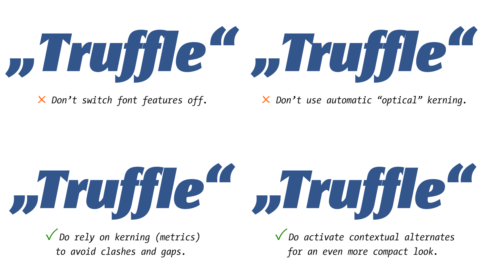
Applications often turn the standard ligatures and contextual alternates OpenType features on by default, while they have the discretionary ligatures feature off.


Koning Display’s ligatures are space-saving, but if you find ligatures too distracting, switch the ligatures feature in your app off.

Koning Display’s fonts have substitutions in the contextual alternates feature ensuring that text stays compactly spaced, even without ligatures. For instance, the fonts have three different f-variants, which each make room for the various possible shapes that could come after that letter.

Signage arrows


Text arrows
Activate by choosing oldstyle figures or stylistic set 4.


Three shapes for dots
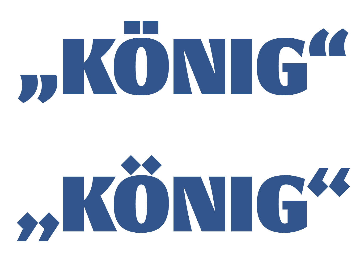
By applying stylistic sets, considerable changes can be made to the typeface’s appearance. For example, Koning Display’s dots are rectangular by default. But each font has two kinds of alternate dots to choose from (with matching punctuation and diacritics to boot). By dots, we mean the marks on top of i and j. With diacritics, we mean accents like ċ and ö. Punctuation includes the colon, comma, period, etc.
Stylistic set 14 replaces a font’s diacritics and punctuation marks with hairline versions of those forms. We call this Koning’s “hipster” style!
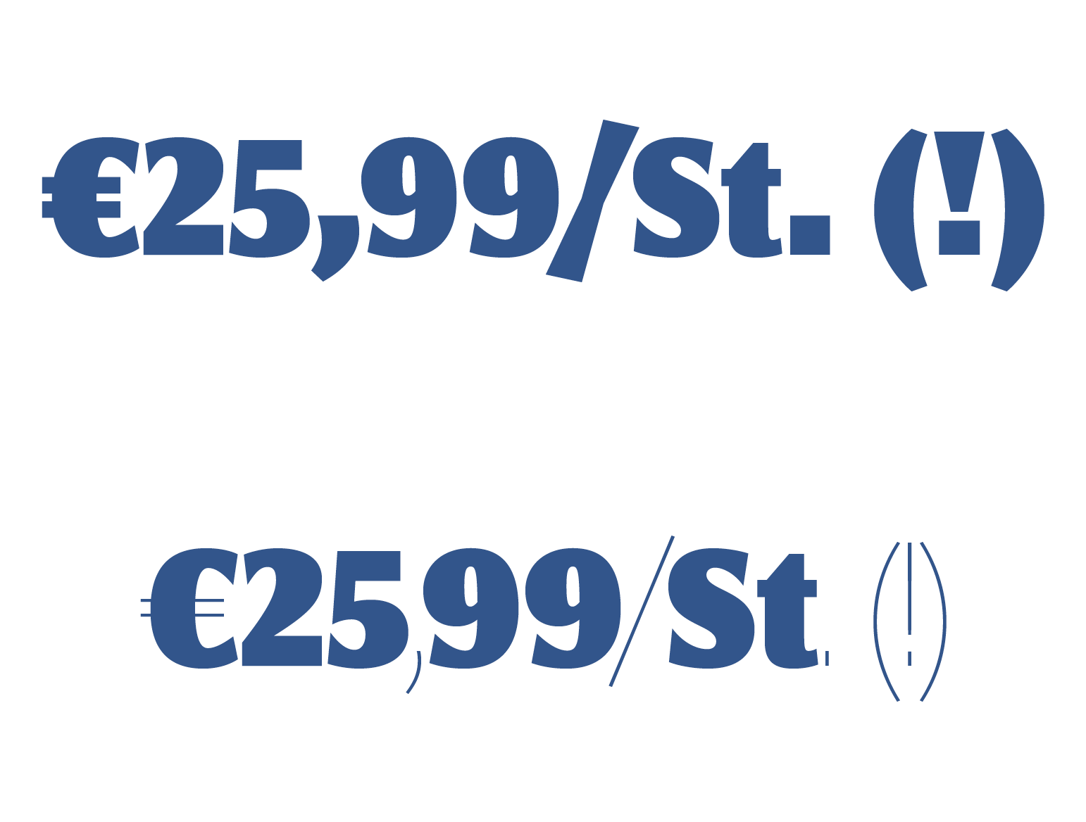
Stylistic set 15 replaces just the dots on i and j (and ligatures with those in them) with hairline forms.

Stylistic set 16 replaces a font’s diacritics, i and j dots and punctuation marks with diamond shapes. We call these “royal dots.” Koning is a royal typeface, after all.
Standard fractions

Cap-height fractions
Access shorter fractions via the case feature. In InDesign, do this by selecting a text and pressing the All Caps button.

Koning Display as variable fonts
Customers licensing all upright fonts also receive the range packaged in a single variable font. This is also true for the italics. The variable fonts are not sold separately for now.
Koning Display’s variable fonts each include a weight axis. This technology offers several advantages. Even though Koning Display already has ten weights, installing a variable font allows you to choose the exact letterform weight you need. If you find our pre-defined Bold a hair too light, and our ExtraBold a bit too dark, you will be in luck with this bit of tech. The file size of one or two variable fonts is much smaller than 10 or 20 individual font files. Using variable fonts in web design allows you to specify more font styles on a page without having to burden your visitors with larger download amounts. Furthermore, the axis can be used in websites to create animations and creative user interactions. And of course, the pleasure of being an early adopter of cutting-edge technology is another good reason to license these fonts.
Ornaments and catchwords
Koning Display’s design includes several ornaments for playful and professional use. These ornaments are part of the character sets of each font, and their stroke thicknesses have been adjusted in each weight so that they harmonize well with the alphanumeric glyphs.


More Koning to come!
Koning Display, as it is now, is the family’s first release. We are working on expansions, support for additional languages and our customers’ needs.
We hope that you have enjoyed this explanation of some of Koning Display’s design and technical features. For an item by item list, have a look at the typeface’s package overview page. On the styles page, you can input your own text and see for yourself how it looks in each of the 20 styles.
