Floris
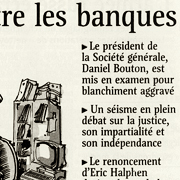
Throughout his career as a type designer, Luc(as) de Groot has been involved in redesign projects for daily newspapers, from the Brazilian daily Folha de S. Paulo to the German Tageszeitung and the international free newspaper Metro. In 1999 he was commissioned to design a new headline face for the prestigious French daily Le Monde. In 2001, this typeface won an award in ATypI’s worldwide Bukvah:Raz! type design competition.
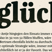
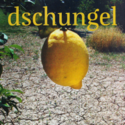
The Le Monde typeface was further developed, resulting in Floris LM, a rather narrow display face in six weights with pronounced vertical stress. Its condensed structure and expressive shapes allow for economic yet attention-grabbing headline setting.
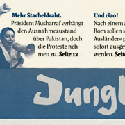
In 2007, Floris was redrawn as part of a drastic redesign of the German weekly Jungle World. Floris JW is a headline family in weights, from ExtraLight to Black. The Jungle World project also resulted in Floris Text, a new typeface for publications, which is still under development.
Floris and Jungle World
