Corpid
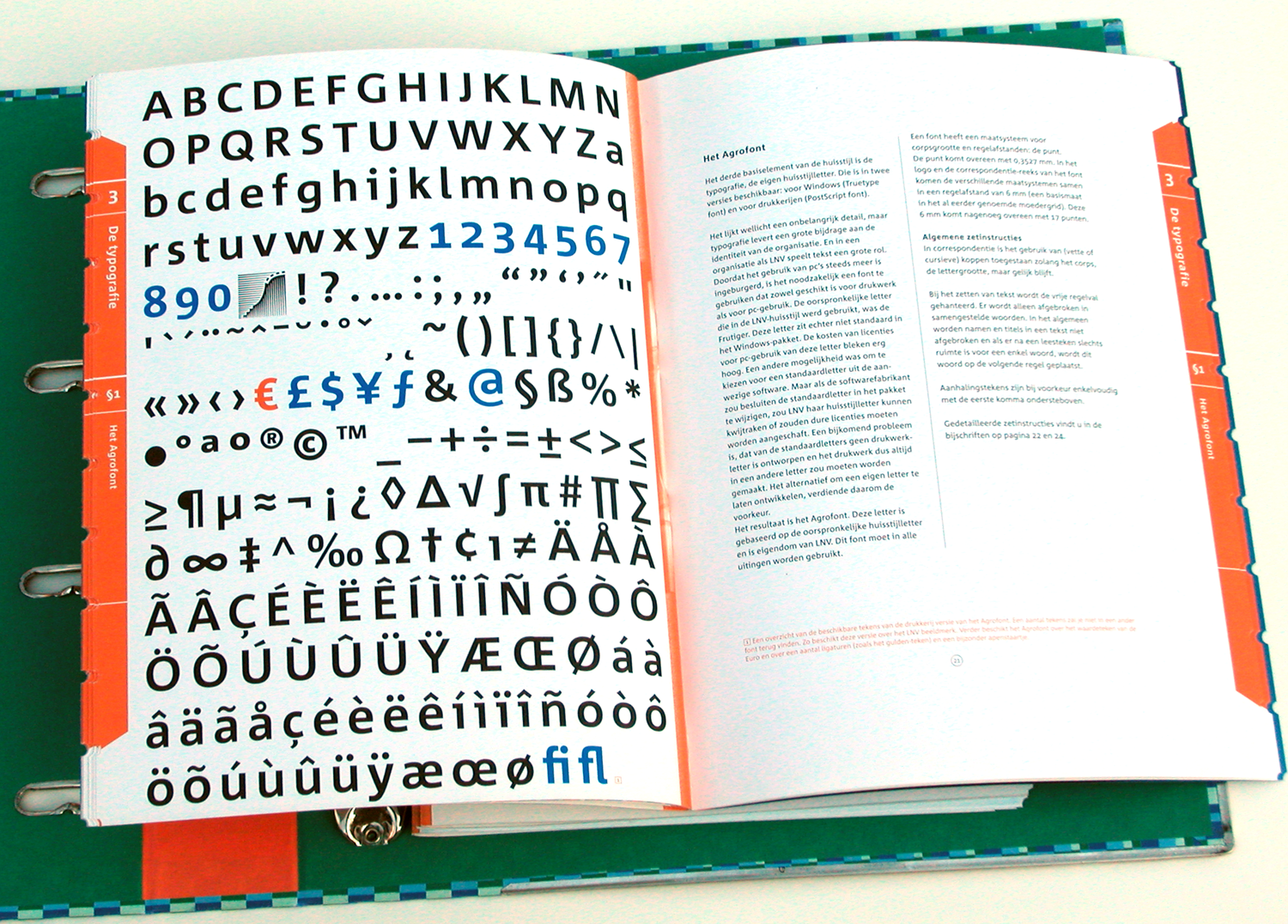
Corpid was originally commissioned by Studio Dumbar in the Netherlands as a corporate typeface for the Dutch Ministry of Agriculture, Nature Management and Fishing. The font was designed to replace the existing standard typeface (a well-known business-like sans-serif) to provide the organization with a unique and strong identity.
Although it was designed to fit strict technical requirements, Corpid has a personality all of its own. This was in part a result of what Luc(as) calls “creating tension” between the inner and outer curves of each character. “I tend to put a little more diagonal contrast into fonts than is the case in most neutral sans serif fonts. This brings a certain humanistic touch to the typeface. Much more subtle here than in Thesis – but although it is almost invisible, it is still palpable.”

Corpid’s many faces
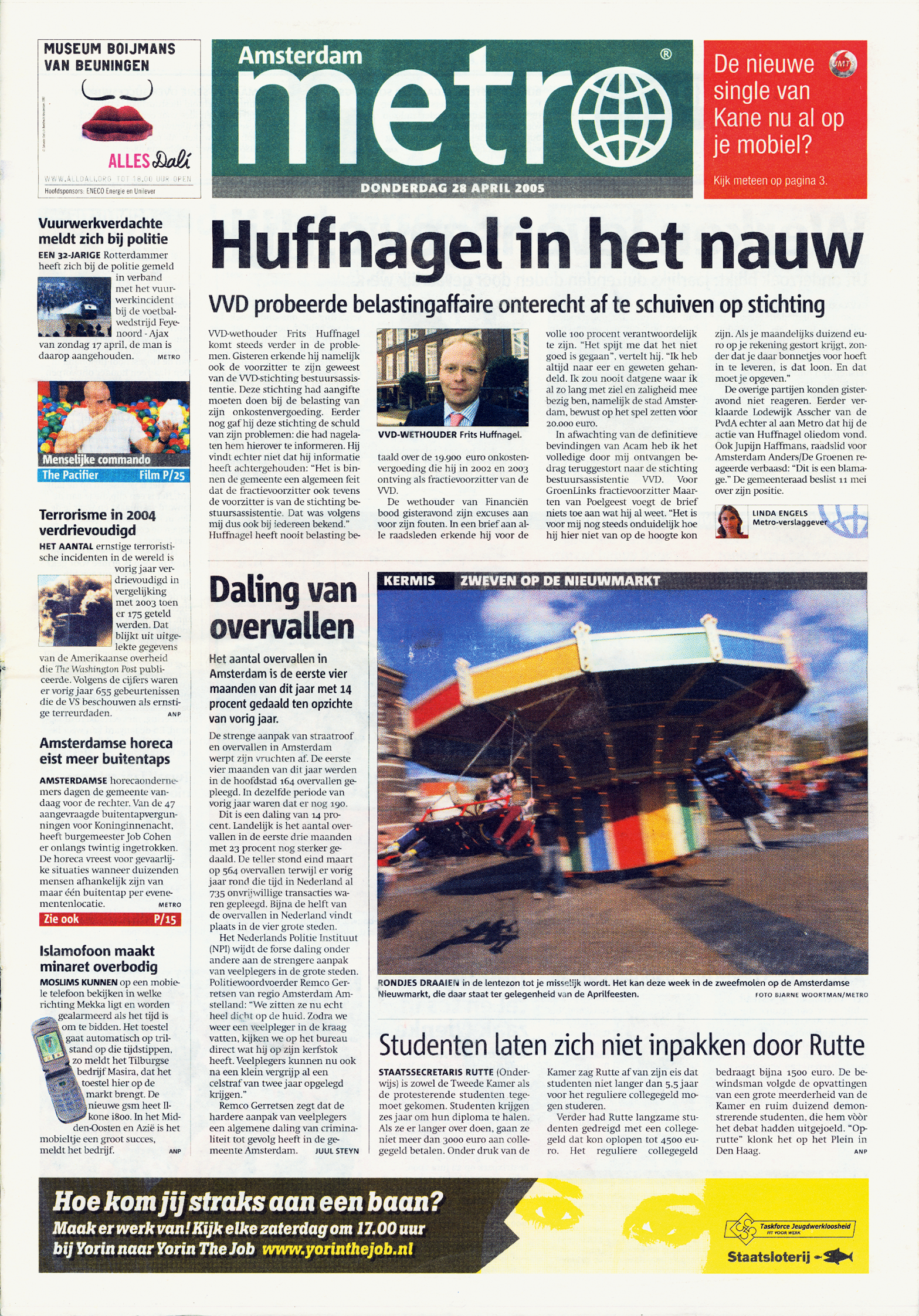
Corpid Customized. Corpid’s multiple-axis masters were made available to Metro’s design team, enabling them to choose the exact width, weight and contrast needed for the new headline face.
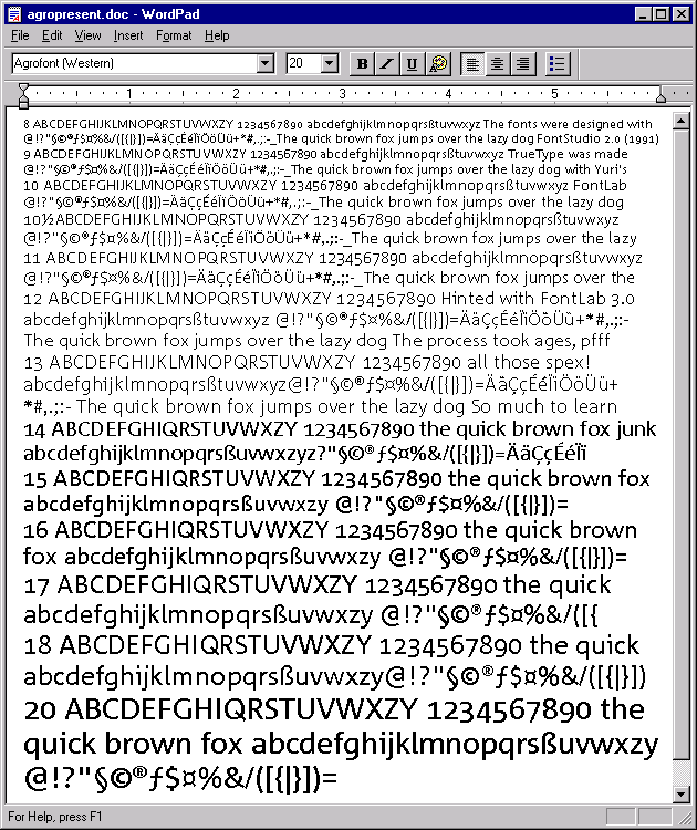
Delta Hinting. Corpid Office is a TrueType sub-family with manual hinting for optimum on-screen legibility. Nothing beats manual hinting for worry-free use of a typeface in the office environment.
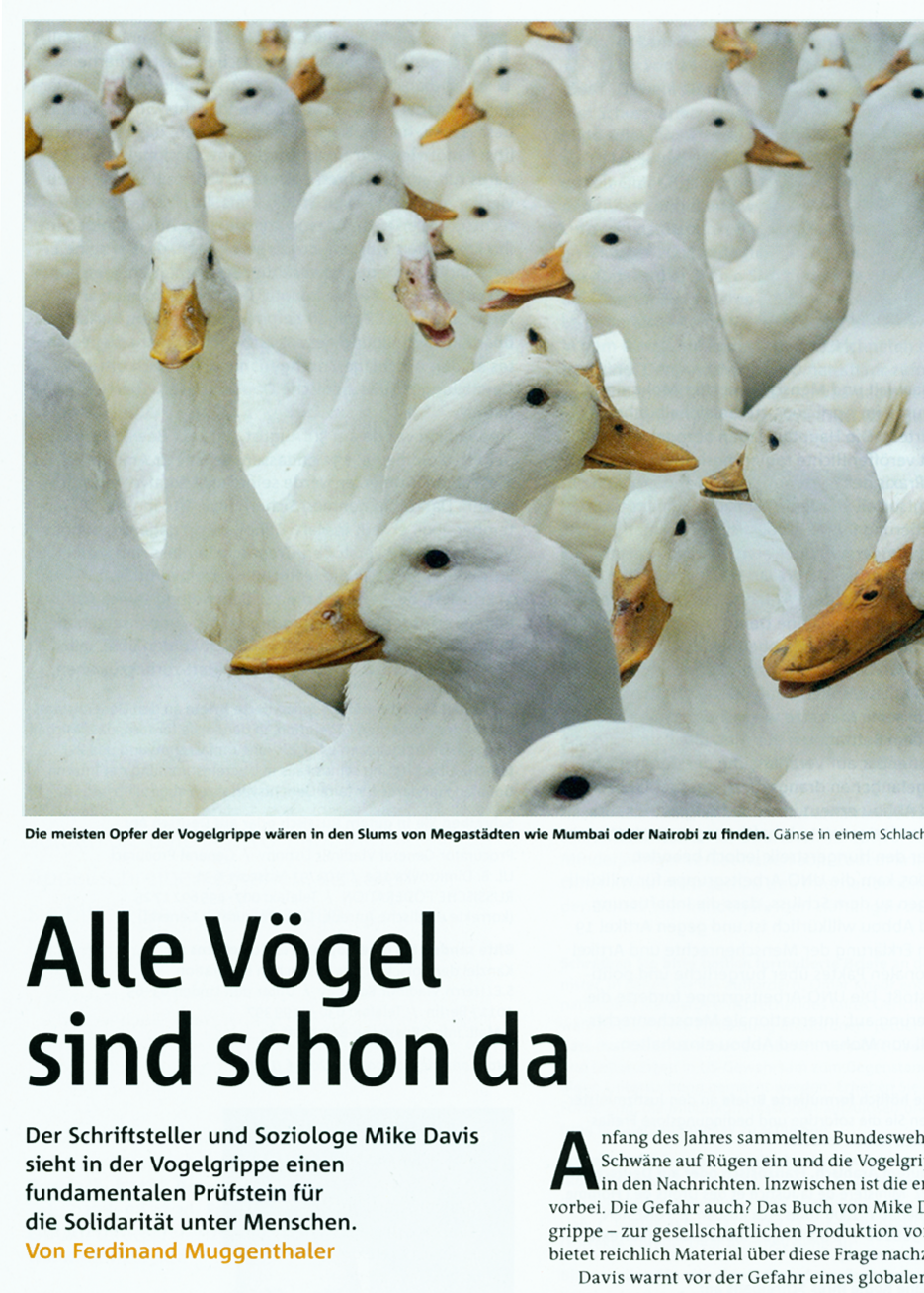
Three widths. Corpid has Normal, Semi-Condensed and Condensed widths. The latter was originally developed for Amnesty International Germany’s magazine and made available to them for free.