Heineken Corporate Fonts
Published Feb 12, 2019. Last updated May 20, 2020.

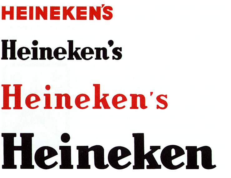
An international brewing company based in the Netherlands, Heineken has been in business since 1864. They’ve refreshed their logo several times over the years. As you can see below, they first moved away from capital letters, then dropped the apostrophe s. Heineken’s became Heineken.

Back in 1999, the Amsterdam agency BRS Premsela Vonk was tasked with overhauling the Heineken identity. This was the firm Luc(as) had worked at earlier in the decade, before moving to Berlin. Earik Wiersma made sketches for letters to accompany the Heineken logo as a series of typefaces, and Luc(as) was invited to optimize their design. He completed the typefaces, developing them into font families. This was a great opportunity to collaborate with Earik and former teammates to help make a well-known Dutch brand’s identity even stronger.
While BRS Premsela Vonk in general, and Earik in particular, were responsible for the new Heineken corporate design, Luc(as) contributed valuable feedback that helped make the final artwork more consistent. He helped make sure that it worked at virtually any size, too.

Earik delivered sketches for the Heineken Sans, Heineken Serif, and Heineken Hybrid’s upright designs. Luc(as)’s primary design contribution was the families’ italics – particularly Heineken Serif Italic, which he still considers a great typeface, all these years later.
By September 2000, Luc(as) and his FontFabrik team had eleven fonts ready – the ten fonts in the image above, plus Heineken Hybrid. Each sub-family had an individual character of its own, but they were all related enough to be harmoniously combinable. FontFabrik designed thirteenth and fourteenth styles, too: Heineken Serif Black and Black Italic. Since those letters were too close in weight to the company’s logo, Heineken didn’t use them (in corporate design, you want your typefaces to be visually different from the logo). However, they were helpful in Luc(as)’s workflow. He was able to pair the two Serif Black fonts with the Regular and Italic fonts to interpolate the Bold styles.
Luc(as) redrew the letters, spaced them, and kerned them. In particular, he improved the cant of the letters’ serifs. If you look at the letter “I” in the second line of the image above, you’ll see that sides of all four serifs are diagonal, for instance. The Heineken Serif fonts had been initially derived from the Heineken logo. The Heineken Sans and Heineken Hybrid fonts, in turn, were derived from Heineken Serif. Heineken Hybrid was only developed in one style, as it was just used for setting the logotypes of divisions within the company, etc. All of these fonts were exclusive to Heineken.
The new custom fonts helped rejuvenate Heineken’s brand image, making the company look younger and more at home in the 1990s than the 1890s. The new Heineken Serif fonts epitomized the Dutch word gezellig, meaning “cozy, homely, social,” while Heineken Sans added a touch of modernity – evoking everything the Heineken name stands for.

For at least a decade and a half now, it’s been common to include multiple figure styles inside of fonts, and allow users to specify which one they want via OpenType features. Yet back in 2000, OpenType-feature support in design applications was still practically non-existent. The way that most designers accessed a different figure style back then was to which from, say, the normal version of a typeface to an OsF style (short for Oldstyle Figures). That’s exactly the solution that Luc(as) provided for Eden and Heineken.
Oldstyle figures offer a degree of typographic sophistication, and they are indicative of the kind of care that Luc(as) brought to his work on the Heineken fonts for Eden. They remained part of the face of the company for eleven years. Even if Heineken moved on to another design a decade ago now, we still look back on this particular redesign fondly.