Custom type
Published May 08, 2018. Last updated Feb 10, 2025.
Despite the effort put into retail typefaces, no font will work equally well in all environments. If the font you’re using doesn’t fulfil your needs, the best solution is often to pick another typeface. When there is no existing font out there that will fit the bill, a bespoke font might be what you need. Custom fonts are made more often than you might expect; tailoring unique solutions for clients is what we spend most of our time doing.
Technology solutions
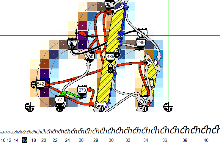
Even today, many fonts are designed with print in mind, rather than on-screen reading. Most of the time, good print fonts will work as expected in other media, too – even for developers building apps or websites. But when manufacturers install fonts in their products, they often encounter unexpected issues: maybe the strokes of some letters don’t render consistently on small, low-resolution screens. Or maybe the type isn’t legible at all. When this happens, a font that’s tailored directly to your device’s specifications is needed. Just switching fonts won’t solve the problem.
We have answers to those font problems, thanks to our extensive knowledge and experience tailoring letters to render optimally at various sizes on particular screens. For years, we’ve provided bitmap fonts used on displays running inside automobiles. Also for household appliances like coffeemakers, dishwashers, and washing machines. LucasFonts developed several internal tools that can do all sorts of crazy things when it comes to hinting and then generating size-specific bitmap fonts from outline-based TrueType fonts. This means that we can generate bitmap fonts from your existing corporate fonts, something standard font editing software cannot offer.

Luc(as) de Groot has been obsessed with improving screen rendering since the mid-1990s. In the early 2000s, he was one of the designers selected by Microsoft to contribute to the ClearType project, designing two of the typefaces that have included with Microsoft products ever since Windows Vista was released: Calibri and Consolas. While Calibri was the default font in Microsoft Word, it became one of the most-read fonts in the world. You’ve probably encountered it at least once today already.
FontFabrik
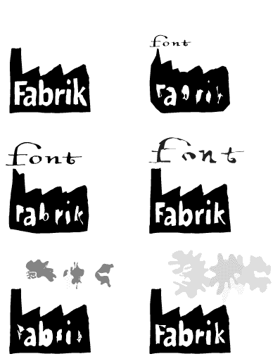
In general, LucasFonts is a retail brand. Design projects – both those we undertake for clients as well as for ourselves – are often performed under our FontFabrik label (Fabrik is German for “factory”). Some of that work was later expanded into typeface families that joined the LucasFonts family.
What can be done?
We regularly partner with both design agencies representing corporations – or with companies’ in-house design departments themselves – to develop typefaces for projects ranging from complete rebrandings to one-off corporate or cultural events.
With custom work, you pay once and never have to worry about future costs accruing as you use your fonts. Our custom fonts have no distribution or licensing fees. You can give the custom fonts to everyone in your company without having to license them for a specific number of users. You’ll have problem-free sharing of the font files with your vendors, too. Send the fonts to anyone who needs to use them!
You can use our custom fonts in every conceivable medium, including as print fonts, webfonts, in eBooks, for applications stored on web servers, as fonts embedded in mobile apps or other computer programs, and even in areas that haven’t been developed yet.
When it comes to custom work, there are roughly three models: new typefaces, director’s cuts, and doctored classics.
New typefaces: If exclusivity and originality is an issue, custom-made typefaces are often designed from scratch. The typefaces we designed for Der Spiegel, Die Tageszeitung (taz) or Sun Microsystems are cases in point. For Heineken, a new eleven-style type family was designed on the basis of just the five letters from the company’s logo. For Siemens, Luc(as) developed several fonts and pictogram sets for use on the small low-resolution screens on washing machines and other appliances.
Director’s cut: The most common form of customizing at LucasFonts is to adapt one of our own type families to a client’s needs and wishes. There can be many reasons for wanting a modified version of a font – aesthetic, linguistic, technical, editorial, economic or even political reasons. Proactive thinking about clients’ needs and wishes is second nature to us. Most of the typefaces available on this website started out as custom-made fonts designed for a specific client and to solve a particular design problem.
Doctoring the classics: There are instances when a client would like a special or optimized version of an existing classic, such as the Futura variants we designed for Volkswagen and Elle magazine.
How does this all happen?
If you’d like us to design custom fonts for your business, or for a client you represent, e-mail sales@lucasfonts.com. Providing details about what the project would entail will help us respond more effectively.
