Luc de Groot, Early Work
Published May 08, 2018. Last updated Jul 29, 2019.
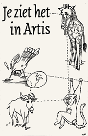
From 1983 to 1988 Luc(as) de Groot studied at the graphic design department of the Royal Academy of Arts (KABK) in The Hague, where his most influential teacher was Gerrit Noordzij.
“In the mid-1980s the Academy was quite a traditional school. It was a five-year curriculum of which the fifth was a ‘practical year’ spent as an intern or freelancing. During the first year we learned all kinds of basic traditional stuff like lead type setting and drawing and perspective – a very good foundation for all aspects of graphic design. A the time, the profession of graphic designer was not as specialised as it is today. A graphic designer would normally cover many different disciplines: packaging, typography, layout, illustration. The school aimed to teach us all you could possibly need to be a graphic designer.”
“At the KABK, then and now, type design was just one of the subjects among others. It was just as important as photography, illustration or typography. It was probably unique to The Hague, though, that type design was important at all. Each student had to finish two type designs by the end of his or her school career, just as they had to offer an bunch of illustrations and a set of photos and typographic designs.”
Hand-lettered book cover designs, 1988–1991
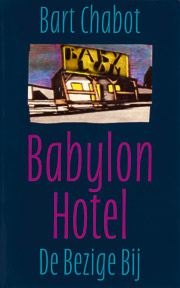
In 1987–88, Luc(as) spent his practical year freelancing for Studio Tint in The Hague, among other clients. From 1989 onwards, he worked at BRS Premsela Vonk in Amsterdam. At both studios he designed several book covers with hand-drawn alphabets that were reproduced photographically.
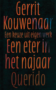
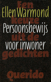
Hand-drawn alphabets, 1983–1987
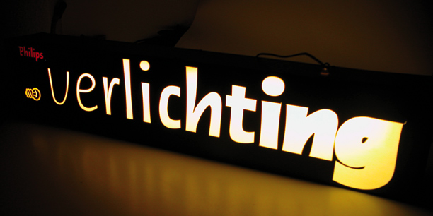
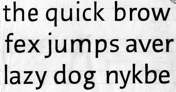
Type design was part and parcel of the KABK’s graphic design curriculum. Among Luc(as)’s hand-drawn alphabets were Narsdesis, a semi-serif that was one of the examples for TheMix, and Lucas Met Haakjes (“Lucas with brackets”), a set of letters in eleven weights made for a lightbox. A seven-weight family was designed for a calender that used a different weight for each day of the week.
